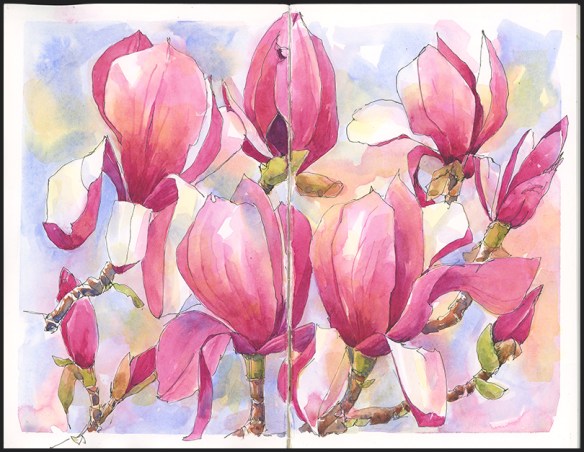
Surrounded by Magenta
After a winter of painting with brown and earth-toned pigments, it feels extravagant to use so much magenta. But this particular variety of magnolia had magnificently deep-colored blossoms and I found myself dipping into paint pans that I rarely use. With the tree in full bloom and fallen petals on the ground it was a delight to be surrounding by so much color.
Tips and Techniques– When you are using a strong color like quinacridone magenta, it helps to tone it down. I used yellow ochre and aureolin yellow, which produce some lovely warm shades of pink. Mixing with cobalt blue gave me cooler and darker tones for shaded areas. Test out the reds in your paint box. Red plus yellow doesn’t always give you orange, especially when using cooler reds like alizarin crimson or quinacridone rose. Red plus yellow can produce excellent flesh tones and subtle pinks.

Thank you Jean for continuing to share your beautiful work. This one in particular is so uplifting.
Hi Audrey- Hope you and Don are faring well and seeing spring colors in your neck of the woods. Nice to hear from you!
Thank you Jean for the tips regarding mixing pinks and flesh tones. Will give it a try! All the best to you!
You’re welcome. I hope you are pleasantly surprised by some new color mixes. Add a lot of water to get pale shades.
Pretty in pink! So uplifting and cheerful Thank you. And thank you for the tips on mixing reds. I never know where to start. I’ve messed up more than my share.
We all mess up– that’s how we learn. But if tip here or there creates a shortcut, I’m all for it. Try each of your reds with the different yellows you have and with varying amounts of water– you’ll see which ones go orange (the warmer reds) and which can create subtle pinker shades.
Lovely.I do so admire the the almost sculpture like magnolia blossom, sadly it would not thrive in my soil. I must make a note of your colour tips, thank you again
I tried growing one once and the mice ate a ring around the bark over the winter and it didn’t survive. Seeing them this year makes me want to try again.
Magnificent Jean! Very pretty background too and yet it doesn’t detract from your main subject which are the stars they deserve to be!
I thought I was going to approach this as a negative painting and did a wet-in-wet background to start. I then changed my mind, but and had to work with uncontrolled background. Glad you think it works!
Gorgeous! Yes….what a sumptuous saturation of color!
Thanks Laurel– I bet these wouldn’t survive the Helderberg winters. Do you see any up there?
Not only the colors, but the composition says “Joy” too. This isn’t a color I normally am attracted to but I received a beautiful hand-blown glass vase in magenta tones, so I’m beginning to like it more. 😉
I’m so glad I found this post! You’ve solved the mystery for me of how to use these colours. Thank you! Gorgeous painting.