The Intersection of Art and Nature
I love finding myself at the intersection of art and nature. My passion for those two roads has led me to great places, wonderful people, and to beauty, insight, and mystery. Here, a simple fern in the Lyman Conservatory at Smith College has transported me half a world away to the rain forests of Malaysia. It has made me think about symbiotic relationships and to wish I had taken Latin. It has given me hours of artistic challenge and pleasure. And it has left me both grateful and eager for more.
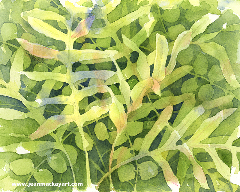
(click to view larger; top: watercolor and ink in Stillman & Birn “Beta” sketchbook 8.5×11″. Bottom: watercolor on 140lb Fabriano cold press paper 8×10″)
Tips and Techniques: I began these two paintings at the Conservatory, knowing it would be fascinating to take two very different approaches. While layers of paint dried on one, I rotated to the other. I had the major shapes established at closing time and finished both at home. What’s interesting to me is how each conveys such a different part of my experience in the greenhouse: one about being surrounded by layers of greenery, the other about a particularly intriguing fern. So, if there is a lesson here, it may be to consider what you most want to capture or convey when you begin drawing or painting. In essence, What draws you in? And what techniques are best suited to sharing that?

Thank you Jean always learn so much from your posts.
Thanks much! Hope your garden is beginning to show signs of green!
Thanks for dropping by. Miserable wet and cold for Easter – snow on the tops again! Going to be way behind on the veg this year. .
🌼
I love the negative paintings. I can’t seem to master that technique, but you certainly have! Really conveys that sense of lush layers of ferns all around.
Hi Beth- Keep at it. Sometimes the early stage look pretty hopeless and then I cross a threshold and it really comes together. I’m sure people who spied this in the greenhouse really wondered what I was getting at.
How can I find out more about this technique? I’m assuming it’s how you painting the second image? I’ve been staring at it…trying to figure it out! Was wondering if you put frisket over your lighter layers and then did the dark tones?
Hi Kat- I suggest you do a Google search…try Negative Painting with Linda Kemp. She is a master and has some step by step instructions. Also take a look at negative painting with Brenda Swenson as she is also quite masterful, but breaks it down for you. I didn’t use frisket– I rarely do. I just paint around the lighter layers, going darker with each glaze. Give it a go!
Your illustrations and your words on how and why you paint are equally inspiring. Thank you for the beauty you bring to my day.
What a very lovely compliment, Denise. Thank you for sharing it! -Jean
Hi Jean; I’m always very happy to receive your new posts. Your work is magic.
I’m paint often in botanical garden too: wonder, amazement and mystery, joy of painting and observing the miracle of Nature. In these days I paint shells, extraordinary architectures! all my best and happy Easter from Italy
We have a lovely day here in New York today– the first real hint of what is to come. Enjoy painting shells– no easy task given their architecture and subtle colors. Happy Easter to you! –Jean
Love these two images – they are so different!
So, as I see it, the lesson might also be:Try very different approaches to the same subject – try changing perspective, if you are lucky it can lead to new discoveries and totally unexpected joy …!
Yes– well said Sigrun. Trying different approaches keeps things fresh and helps me push myself. Happy painting!
The trouble, fellow artists and naturalists, is that our botanical Latin is really a blend of Latin and Greek roots. Thus, consulting a Latin dictionary will only get you half-way. Mixing roots from different languages in a multi part word is called a “Macaronic compound.” E.g. “television” is Greek “tele” = distant, end + Latin “vis” = seen + Latin “ion” = suffix which creates a noun-process from a verb , hence “process of distant seeing.” All educated Romans knew Greek, and used Greek words when their own language lacked them, or when they encountered or studied life forms first in a Greek context, or when they enjoyed the sound of the language. This Latin and Greek vocabulary was passed down from scientist to scientist as part of their Renaissance education 🙂 So on this page of Jean’s we have mostly Greek botanical roots. It takes about a week of practice to learn the Greek alphabet and then you can use Google translate or a Greek dictionary with less fear. Some older Webster’s collegiate dictionaries (pre 1990) will include the derivation and Greek roots of an english macaronic word.ῥιζο = Gk rhizo “root” -ome, -oma, -omatos = “body” ἐπί = Gk epi “on” φύτος Gk phytos, phyte = “plant, growth”λεκανη = Gk lekane “basin” πτέρος = “wing” The Latin root on this page is crustaceus, literally “having a crust or shell,” from Latin crusta =”crust, rind, bark, hard shell”. Taken as a zoological classification by Lamarck, 1801 🙂
I knew I could count on you, Nina, to enlighten me!
I love the look of negative painting. But I’m with BeeGee on that. I don’t get it. But I love looking at others work when it’s done. I love ferns too. So as you’d guess, this painting really caught my attention. Beautiful!
Thanks Erica. Subjects with layers lend themselves to negative painting, so it seemed like a good approach for ferns. Glad you like it!
These are gorgeous, and I can only marvel at the planning which must have gone into the second one! 😁
You’d be surprised Rebecca– I started only with the lightest fern fronds and had no real plan beyond that except to keep adding layers until it seemed done. Once I added a strand of the button fern in the back, I knew I wanted to add more. I find that part of the beauty of a negative painting is letting the loose washes dictate some of it.
Well, it all worked out so beautifully! Hats off to the magic of watercolour and the undoubted skill of the artist. 😁
Always enjoy seeing your artwork, Jean. Very much like the writing especially.
Thank you!
Great food for thought, stepping back and deciding what draws us in, and what technique might work best. Applicable to photography, too. It’s heart-warming to read your description of being at the conservatory. What a bright idea, to tackle two different views – easy to do with the camera, but more challenging with the brush, for sure! Both are beautiful. Ferns are such wonderful plants!
Thanks for your thoughtful comments, Lynn. You are such an engaged blogger– I appreciate how often you share your insights, encouragement, and praise. Beautiful photos on Curves, by the way. More food for thought!
Wow, the layers, the depth, the subtlety of touches of colors other than greens, make this a fabulous painting to behold as it pulls one in. -Bruce
Thanks Bruce…glad to make a connection– I enjoyed looking at your blog this morning. The vibrant colors are terrific.
Love both pieces! And thank you for the tip about working on two pieces at a time –that may be the key for me for waiting between layers 🙂