Ink: Dry and Wet
I recently bought two bottles of Diamine ink—one ochre and one chocolate brown—to use in my fountain pen. I was hoping to find a warm, sepia-toned color reminiscent of the inks used by Renaissance drawing masters. Both inks flow beautifully, and when wetted they can be pulled into light washes.
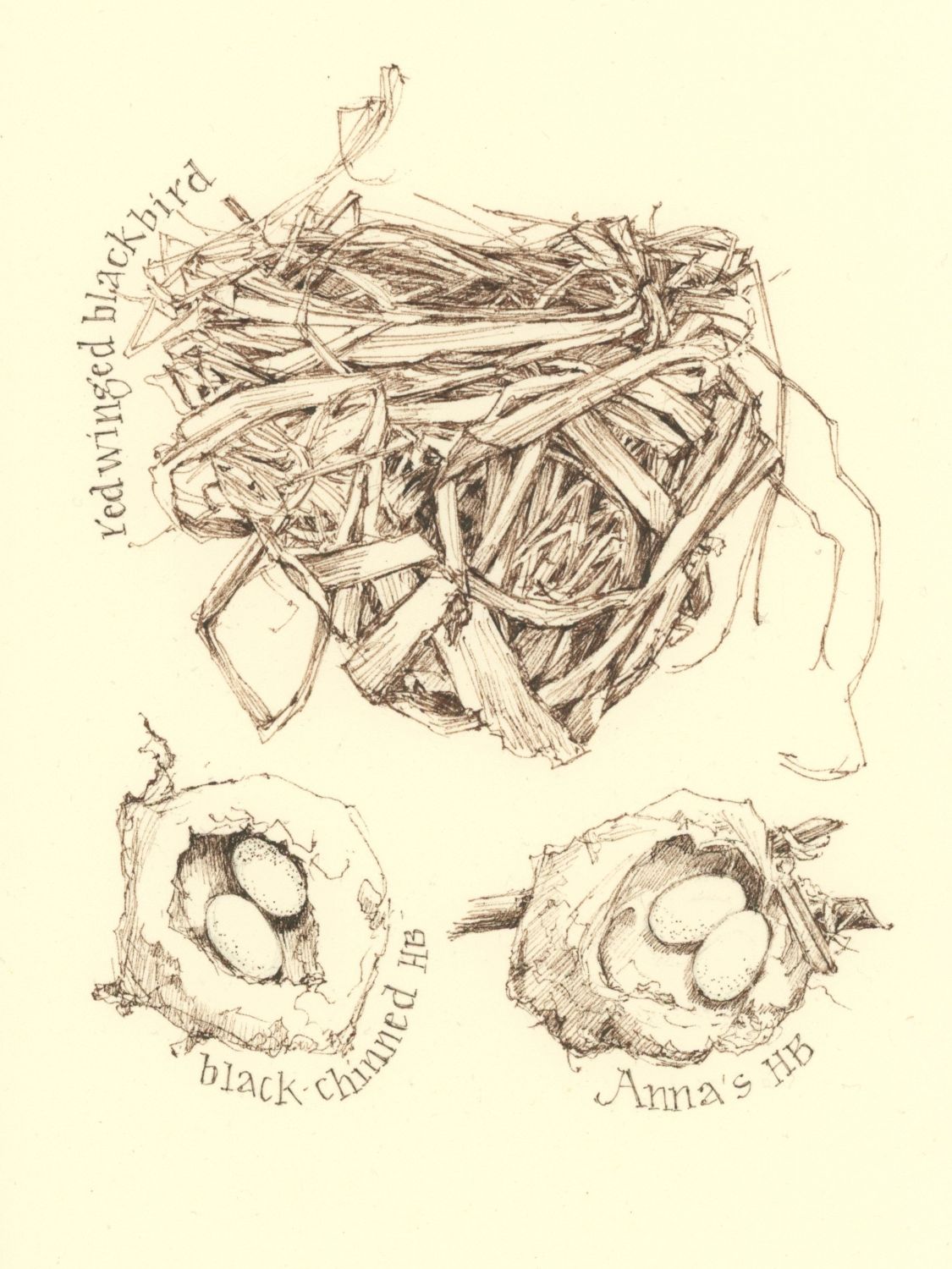
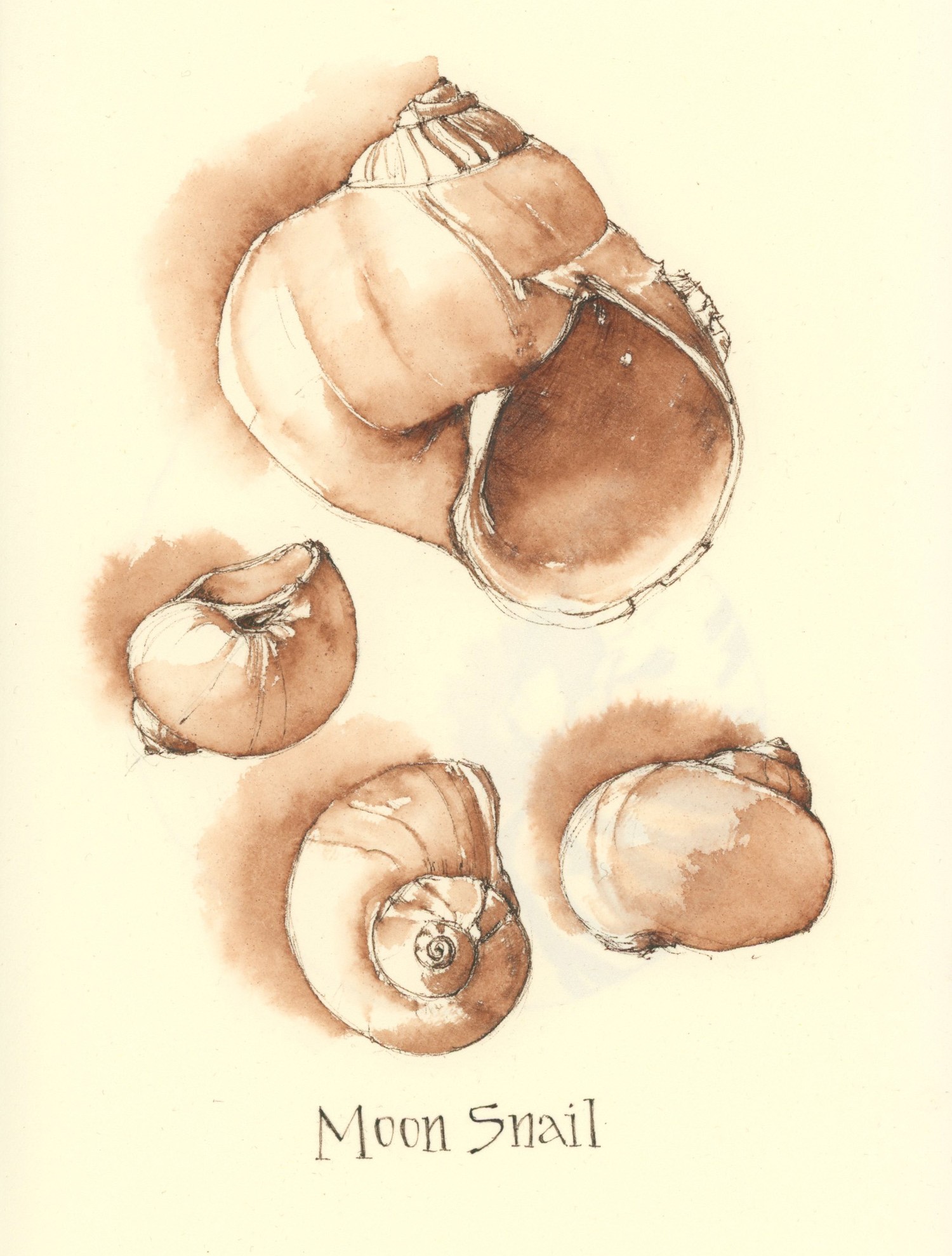
Unfortunately, neither color was quite right. The chocolate brown was too cold and dark, while the ochre shifted toward an orange rust when wet. That led me to start mixing the two, carefully noting and testing different ratios in search of something closer to what I had in mind. Below are the results of my most recent experiments, shown dry and wet. Isn’t it fascinating to see how dramatically the color changes with the addition of water?
Tips and Techniques– Share yours! If you use fountain pen inks and have suggestions for a brand or sepia color that doesn’t shift when wet, I’d love to hear about it.

I use Noodlers Bulletproof black ink. I especially like it in my rapidograph and carbon pens.
Thanks. I have a bottle of that, but haven’t used it in awhile. I used to want an ink that would not move when watercolor washes are applied over it. But now I want an ink that I can pull out for an ink/wash drawing. Lot’s to learn about inks!
Hi Jean, I went through this same process awhile back…trying to find the right sepia ink. I settled on a couple. DeAtramentis Document ink is waterproof and the two colors I liked best were Sepia Brown and Urban Sienna. Gouletpens.com has a great website and carries this ink. They also sell sample sizes of most of their inks so it’s a good way to try out a few. Good luck, Kat
Thanks again for your note and tips!
That is remarkable – it’s hard to believe the colors are produced from the same ink.
It’s quite a surprise to see what happens when you add water.
Hi Jean
These are not fountain pen inks but I use McCaffery’s brown ink for calligraphy and flourishing which is waterproof and can be used with watercolor. Also Cornelissen & Son’s Walnut ink is beautiful but cannot be used with watercolor. I use both with a dip pen nib.
Hope this helps.
Lucille
Thanks Lucille! There are so many varieties and a lot to know. I’ve ruined fountain pens by using the wrong ink and I’m surprised by the difference in flow between brands. It’s good to have a variety for dip pens and fountain pens. Hope all is well with you!
Hi. My sepia-adjacent ink is DeAtramentis Document Ink, Urban Sienna. It’s a waterproof ink. It also has a color shift when applying a wet brush. I took a photo for you, but can’t figure out how to attach it to the comment.
Jaci
Thanks so much. I’ll look for that ink. Appreciate your recommendation!