A Host of Golden Daffodils
Ten thousand saw I at a glance, tossing their heads in sprightly dance...
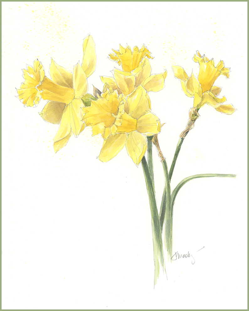
Wordsworth’s classic poem of daffodils, “I Wandered Lonely as a Cloud,” seems timeless. Who doesn’t appreciate a host of golden daffodils or, later, the memory of them fluttering and dancing in the breeze? They are in their full glory this week in my yard and I am enjoying the show.
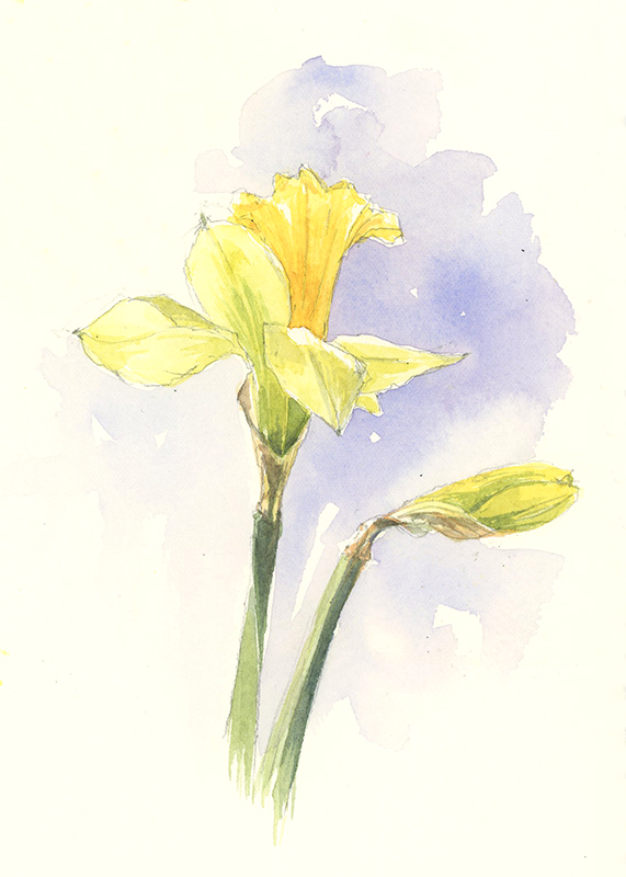
The trouble with daffodils– I can only imagine that Wordsworth’s poem flowed more easily from his pen than this painting sprang from mine. The trouble with daffodils is not only that they can be tough to draw but figuring out the shadow colors and getting a full range of values is hard with such a light color. I have spent the last two weeks taking up the challenge, trying all sorts of approaches (with and without backgrounds, grouped and single, loose sketches, detailed sketches) and numerous yellow pigments—with frustratingly little success. But my 14th daffodil was promising, and I pressed on. Below, you can see my color swatches for testing yellow shadows. I found it useful to mix a small amount of violet with various yellows for the shadows and to apply the shadows first, before adding yellow to the flowers. If you have had success painting daffodils, do share your tips and techniques…I’d love to hear them!

Check out upcoming workshops: Spring Into Nature Sketching- For Ages 8+ in April, Ink and Watercolor Basics for Sketchers in May, and Arts and Birding in June.


Gorgeous daffodils! Thank you for sharing how much perseverance this took. Are we seeing pencil lines or very fine pen lines?
Thanks Sally- I worked in pencil for this. I thought a pen might be too heavy.
These are beautiful daffodils! One thinks “well how hard can it be to draw and paint yellow flowers?” but I understand how tough it must’ve been to get those values without completely muddying up the local color, so very nicely done!
Oh, exactly, Marleny…”How hard can it be??” But I’ve muddied it up plenty of times. What I want to be able to do next is sketch and paint them in a less formal style. Sometimes I need to work out the details before I can begin to loosen up. Hope you’re working on good things lately!
Working on perpetual journaling
but still playing with getting watercolor under some control! 🙂
Beautiful!!!😃❤
Thanks Tonya!
You’re welcome😃❤
Jean ….. your daffodils are amazing and look effortless …. perfect! I imagined being in your garden with you, watching all that yellow dancing in the breeze. Thank you for sharing your progress and challenges in capturing just the right colors. I’ve been attempting convincing tulip drawings and watercolor paintings from my flower garden. Such subtle and pale pinks that only last a brief few days. And then it snowed.
I love your work!
Thanks Barb– nice to hear from you. Spring brings a wealth of beautiful subjects, but they are fleeting. Good luck with your tulips–We had a touch of snow here this week, too, this week, but the daffodils have mostly hung in. Next up will be the spring ephemeral wildflowers, and plenty of opportunities to practice mixing greens.
Lovely job on your daffodils Jean!! I agree…they are very hard to draw well. Mine always look like something a 1st grader might do..lol….I think it’s very hard to make them look as light and “airy” as they are. Your colors are spot on too!
There is a lot of complex perspective with daffodils, plus those frilly edges. At least the stems and leaves are simple! And you are right, it’s easy to overwork them or turn them to mud…as I know from experience.
Thank you! I too have struggled with getting daffodils right! Certainly will try your violet tip! Yours look good enough to pick!
I’ve heard from a few artists lately who share the struggle with yellow– it’s nice to feel you’re not alone, even if the struggle is ongoing. Keep at it!
Love them…just beautiful! 👏👏☀️💛
Thanks Kathy- nice to hear from you!
Your perseverance and planning paid off! These are wonderful.
You’ve captured their strength and their airy beauty! Beautifully drawn, and painted.
(Note to self: do colour swatches first!)
Thanks Alison- The color swatches really helped, and showed me how much variation there is in the different yellow-violet combinations.
Such a Beautiful botanical painting representing the coming sunny days of spring
Thanks Lois. They do mark the transition to spring. Spring is still temperamental, but things are greening up for sure.
I have an array of daffodils and I carefully drew one – in pencil! Too scary to try to paint it as the yellows in the petals were numerous… yours is lovely – but now I am thinking tulips could be easier…
Hi Patti- Tulips probably are easier, but you should have a go at painting daffodils too. If nothing else, it will be an exercise in looking closely at color. Enjoy!
Beautiful daffodils Jean. All of that practice was worth it.
It has been worth it. I decided to skip the dark background and see if I could get them to work without it first. More to do! Enjoy your 200!
It’s reassuring to know that even the best struggle with color! Yet you pulled it together with perfection. Bravo! Beautiful daffodils! And I don’t say this with an ounce of envy. I am only a hobby painter, but I’m always eager to learn techniques. So no critique here. Now…is there a way you could enlarge your color samples so I can practice blending too?
Hi Erica- I can’t enlarge the strip, but here’s what you can do with any colors you want to test (for this I used Winsor violet and each of the yellows in my box. Just mix a touch of violet with yellow and paint a swatch. Add a little more violet and paint another swatch. Keep doing that until your swatches are more violet than yellow. If you mix too much pigment in, add more water. You’re looking to find out the color tones and range you can get with just these two colors. I wanted to see which combinations might give me good shadow colors. I test colors this way all the time when I’m painting to see if I’m getting the color I want before putting on the page. Let me know if this makes sense. I find it a fun way to experiment with color.
Thank you very much. I’ll try this for sure.
Hi Jean, I’m late in catching up with you. Your daffodils are perfect! And I can certainly appreciate the struggle. Kathy Dennis & I sat together & attempted some……with very mixed success on my part. I tried adding some pen lines at the end, and as my note-to-self read: pen lines did NOT help!
What is the 3rd yellow you used? I can read Lemon & Aureolin, but can’t read the last one of your chart.
With thanks and admiration, as always.
Melissa
Hi Melissa- The other yellow test is with yellow ochre, which was useful. I also tested Hansa Yellow Medium. But a good breakthrough came when I broke out Cadmium yellow light and dark. I don’t use those two, but they were very useful for getting the pale petals and deep cup. They are less transparent, so I had to be careful with them not to add too much pigment. Always a lot to learn, eh?
Oh thanks so much! Cads, huh? So that’s why I haven’t gotten rid of those old tubes…….! And I do understand about not adding too much pigment – especially since they were going over your violet shadows. Yup, live & learn – and isn’t that what makes watercolor so fun?!
Same for me with the older cad tubes. Keep at it!
Between that difficult trumpet shape and the yellow color, I can believe daffodils are hard to paint. The shape is easy for photography but yellow? Yellow is tough! It’s too bright, and undefined, especially in the sun. Sometimes, when a photograph is too flat in terms of uniformity of color, I’ll add highlights and shadows in other colors, which is similar to what you’re doing. I wish us both luck in this continuing challenge! 😉