Needing Green
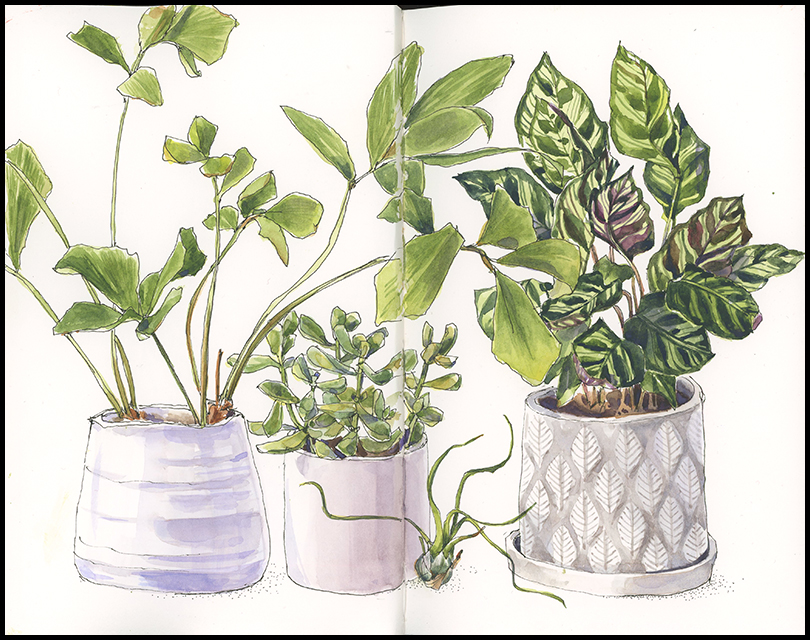
It’s a perennial theme come March: the need for green. The hunger usually drives me to visit a greenhouse for a day of warmth and chlorophyll. Barring that this year, I’m stuck with my houseplants. A poor substitute, to be sure, but it’s nice to paint something that isn’t brown for a change.


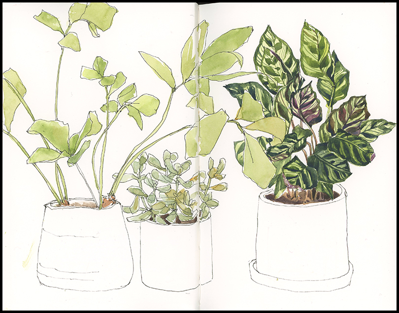

Tips & Techniques– How do you know when you’re finished? That question was posed to me by one of my class participants last week and it gave me pause. I have an intuitive sense about it, but the question forced me to define what I do at the final stages more specifically. In addition to watching this page evolve, consider these questions to evaluate your work at the final stages:
- Have you developed a full range of values?
- How’s the composition? Do you want to add anything to strengthen it?
- Do you want to add text?
- Would a border pull things together?
- Did you convey what you set out to?
The Green Palette: Sap green, yellow ochre and Prussian blue are the main colors I used to mix these greens (Prussian and yellow ochre make some nice gray-greens). The darker greens are sap green and ultramarine. The grays are mainly violet and yellow ochre. I added a light wash of aureolin in places to brighten the other greens.

My favorite color.
So many shades and varieties– there’s a lot to love about green.
As usual, this is lovely. I must say, however, that my houseplants are mostly brown these days!
Sorry to hear that Denise. Maybe it’s time for a greenhouse visit for you, too!
I share that same “need for green” at this time of the year! To me, that is the hardest and saddest part of each year…….when all the green disappears and is replaced by brown. Lovely piece, as always.
I like brown, too, and I find it an easy color to work with, but alright already…let’s expand the palette, right!? Hang in– We’ll get there soon!
Come on over! I’ve been posting images with lovely spring greens in them!
I’m in the same boat; I need to see spring greens and other saturated colors at this time of year.
Spring greens most welcome! I’ve mainly seen it in tiny patches of moss. Looking forward to more to come.
Thank you for sharing your green mixes, I will note them down as I always struggle to get good real looking greens.
Greens are a struggle Mair. I especially like the gray-green of Prussion blue and yellow ochre. You should try lemon yellow and cobalt blue for gray-greens, too. I like Daniel Smith sap green for all around good greens. It’s not garish straight from the tube and you can tone it toward yellow, blue, or brown.
Lovely drawings, valuable tips! As always. I too share your need for green at this time of year. I keep reminding myself of what’s resting in the frozen ground.
We’ll get there Alison. I’m always aware that spring comes slowly and then all at once. Come May, I can never keep up. I’ll go looking for skunk cabbage this week– I know it’s out there, but with 30mph wind today I can’t see myself sketching outside.
So true!
Very windy here also, which helps melt the snow. 🙂
I’ll start seeds soon, a welcome wee bit of green, albeit indoors.
Lovely sketches – I love to see the step by step process, it’s really helpful…
Thx! I like seeing the step by step too. I find it interesting to go back through them.
it is a real need, that yearning for green. My eyes are starved for it
I bet. Evergreens don’t quite count right now either, do they.
haha, no, evergreens just won’t do. Well soon enough green will be the main thing I see, can’t wait
Thanks for this example Jean.
Really took to heart your ” finishing”
Comments, lots to think about and decide
” Am I done?” And of course you ingredients list for paint hues, thanks!
Yes, love the return of Green! Thank you for your tips on mixing greens. You do them so well. And I so appreciate the slide show of your process. 🙂
Thanks Susan! It’s always instructive to fool around with mixing greens. I’m always learning what different combinations will do.
❤