Wishful Thinking, March
I could have titled this post: Ready for Color, or Envious of Those Experiencing the Desert Wildflower Bloom, or simply Tired of Brown. Rather than painting what’s outside this week, I decided to create my own poppy field. This piece is bigger and bolder than I typically paint. I’m still not sure what I think of it, but it has been nice to experiment with some brighter colors and assuage my wishful thinking.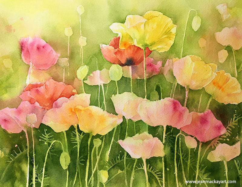
Tips and Techniques– I created this piece using negative painting techniques, starting with a wet-in-wet wash of QoR Nickel Yellow Azo, Quinacridone Magenta, and Transparent Pyrrole Orange. I let the colors merge on the wet paper and, when dry, began adding graded washes of sap green (sometimes with Ultramarine Blue), painting around the flowers and picking out stems, buds, and seed pods. There are a number of layers here, each one adding depth. I could have kept going, adding more darks, but at some point, it was best to quit, rather than risk the piece getting too fussy and overworked. (The paper is Fabriano Artistico, extra white, cold press, 300lb/640 GSM, 11×14”)

Lovely!
Love the colors you used – just gorgeous!
Thanks Evelyn. They are in QoR’s “high chroma” set and they are pretty intense. I like them for their transparency, which you really need for this type of painting.
I love this one!
Thanks Monique!
Beautiful art! Thank you so much for sharing a breath of spring on a blustery day in the Midwest.
Blustery here too– it’s that grand battle between Winter and Spring. At least we know who wins. Thanks for your comment.
One of my favorite paintings, which you have shared. It gives us in New England
a sense of hope that spring will emerge in all its glory as it does every year – eventually.
Hi Louanne- New England is looking awfully brown these days. But for a few glimmers of spring, we might be feeling worse. I guess this what gives us fortitude. Glad to bring you some good cheers on another overcast Sunday.
Really cheerful on a dull day here 🌼
Beauty!! I have a poppy watercolor painting that I never finished! You inspire me to go back and do it!! I love the diversity of colors. How you have both warm and cool tones and good range of values! Thanks for sharing!
I have a few paintings like that…stopped mid-way. At some point, you have to tackle them or let them go. Hope yours turns out well!
Good to know I am not the only one in need of a little brightness.
Simple beauty, can’t beat it. More, please!
Thanks Treva! Poppies are such great flowers. I plan to plant them this year, in hopes of having good subjects right in my backyard.
Really love this painting…..fresh and colorful! 👏👏🎨
Thanks Kathy! Glad you like it!
Gorgeous painting. Thanks for sharing the colors.
I really love how you were able to achieve this depth of color. The painting draws you in as you follow the light to dark gradations. Really beautiful!!
Thanks Mary- Hope you’re doing well and painting away!
Your poppies are stunning Jean – I love them and the colours are gorgeous!
Thanks much Evelyn! I think I need to go to the store and get some tulips!
Beautiful poppies just dripping with luscious watercolors.
Thanks much! I’m looking forward to growing some in my garden this summer.
Stunning Jean. I felt like I was looking through an early morning meadow of delicious color!
This is so lovely. Thank you for sharing the process which is so helpful. Here in North Wales UK Spring has come and bursting out everywhere,you feel you want to put the brakes on so you can enjoy each change.
We’ll have the same here in about a month. Until then, it hasn’t really begun to green up much. Soon, we hope!
A beautiful painting: so precise and free it captures the delicacy of poppies perfectly. I am curious-how many hours did it take to paint (excluding the drying time)?
Hi Holly- I worked on this over the course of a week, mainly evenings after work, so I’m guessing it took me about 6 hours. It’s really hard to figure, since I get up and do other things during the drying time. Does that sound like a lot? I wish I could work more quickly, but I tend to be a slow painter.
no, it sounds just right. and you have given me hope. i get so impatient to be able to paint fast when i know good things can come of moving slowly and thoughtfully. Your work is beautiful.
Oh so beautiful and dreamy!! Love the gorgeous colors. 💚💗
Thanks. The colors are quite vibrant, but also very transparent so you can do many layers and they still remain bright.
Gorgeous! The poppies and pods are beautiful, so light and airy. I noted that you used 300lb paper allowing you lots of layers of washes. I have not done a negative painting in a long time. Your painting has inspired me to try again. Thanks for sharing.
Thanks Bernadette. I have done negative painting on 140lb, but doing it on 300 was really helpful. It just holds the water so well. Try it again!
I wonder if you planned out this entire layout or was your first washes of spontaneous colors what prompted where your flowers would go? It is exquisite!
I did plan the major flowers. The outliers and pods came later, based on how the washes turned out.
It’s beautiful, and I love “Wishful Thinking – March” – that’s so perfect. I like the way everything seem to radiate upwards, more and more airy towards the top, like the flowers could take off and fly. It takes a true pro to do that!
Pure magic! Just what I need!
Nice to hear Betsy!
I love the delicate quality of the petals. Beautiful!
lovely . . .
I love that it’s bright and bold. The picture makes me happy.
Thanks. I needed bright, bold, and happy!
Beautiful! I love negative painting and you did stop just at the right time!