Reds
My previous post on tulips left me eager for more reds, though this week, I’m back to birds and words. What better choice for reds than the Northern Cardinal, the most colorful bird at my feeder in winter? But isn’t red just red, you ask? Well, absolutely not. You can see that I’ve experimented with different reds (and yellow) here— mixing combinations of transparent reds in a range of warm and cool tones. Other than alizarin crimson, these aren’t colors I use frequently, so this was a worthwhile experiment.
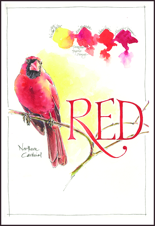
Tips and Techniques– Here’s the line up of colors at the top: Nickel Azo Yellow, Quin Magenta mixed with Transparent Pyrrole Orange, Vermillion, and Alizarin Crimson. The Vermillion looks heavy because it’s Dr. Ph. Martin’s Synchromatic Transparent Water Color, an intense liquid watercolor that I’ve had in my desk for years, but rarely use. The point here isn’t to go out and buy any of these colors, but to experiment with your own. Try mixing the ones on your palette (or in your drawer) to see how much they will do for you.

Such a wonderful bird. It’s like white I suppose. It’s not always crips and clean.
Gorgeous Red! And, what a stately fellow.
So nice to have a pop of color in March!
Came out great and I love how you showed the various reds you used. I’ve been painting the birds at the feeder, counting down the days til the flowers start blooming!
I think we still have a ways to count, Eileen! I’m trying to remind myself to enjoy the slowness of March. When spring hits it comes too fast to capture it all.
Jean foe whatever reason, your drawing of the cardinal is coming up as a block of black. No matter what link I use, still comes up black. Janice fleetwood-bean
That’s weird Janice. I’ll check the backend, but I am seeing it on my screen. Thanks for letting me know.
Lovely Reds! Like how it interacts with the yellows and goes a little orangy.
Hi Al- Some of these colors are in the QoR high chroma set. I like their transparency and intensity. The colors in this set are all a bit strong on their own, but they mix beautifully.
I really enjoy your test markers of colors used in your paintings. Hard to believe
The full range you achieve while only using a few colors. I must say I love how
You have captured this cardinals head, crown down , very playful. Love it Jean!
Thanks Cindy! I was pleased with the way the light fell on the bird. And the reds– mmm, some good stuff here.
A beautiful vibrant bird Jean and sound advice about mixing colours – we should all make more use of what we already have instead of keep buying more…
I’m a big fan of limiting your palette unless you know what’s in it and how things mix together!
One of my favourite birds – I always look out for them when visiting upstate NY. Beautifully painted here, Jean – stunning!
Thanks Michael! It’s just on the cusp of mud season here (only the mud is cover by an inch of snow). Gray skies. You know the experience. So we need cardinals more than ever!
Love the colours – and the explanation!
Thanks much! I like how bold these colors are. It’s a nice change from brown.
Love the cardinals…..I had 6 at one time in my tree here in Ohio over the weekend! Love your work, as always Jean………so beautiful and inspiring.
Thanks Teresa– wow, 6!
Your Cardinal has uber personality, Jean! What an expression! And I feel like you got just the right amount of blue into his red, though I haven’t seen a cardinal in years. 😦
I love the way you worked the Nickel azo yellow into the painting, in and around the bird, and the “RED” lettering just sings. Wonderful!
You write the nicest comments! I’m glad I’ve made some breakthroughs with reds in the last few weeks. Too much blue in the red can sink it, not enough and the painting may be flat. I played with the warm and cool reds here to get the cardinal to take shape. And that yellow- it’s really vibrant, but also transparent. I’ve enjoyed virtually hiking with you in the PNW recently. I’ve been on some of the trails you’ve traveled and it’s nice to go back.
What a great capture, Jean. Beautiful Cardinal (ours have been singing from the treetops all day!
Isn’t it nice to hear them singing again? Birds are just beginning to sing here in NY. Songbird migration will really get underway soon!