Season of Abundance
It is the season of abundance. Farm stands and farmer’s markets overflow with luscious color and variety. Gardens are ripening toward their fullest beauty. I am utterly drawn in.

click to view larger
Forgive me if you are a lover of cabbage. Aside from when it is disguised in coleslaw or egg rolls, I find cabbage hard to enjoy…except when painting it. Then the lovely blending of purples and greens and blues, of leaf shapes and of the spaces between them reveal the cabbage’s true beauty.
click to view larger
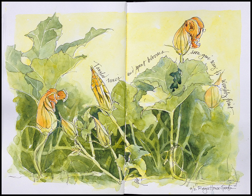
I got down on the ground for this perspective of pumpkin vines. So much happening at that level!
I painted these in my Stillman & Birn “Zeta” sketchbook and I really put it put the paper to the test. Zeta has 270 gsm smooth, white paper that is great for ink but sometimes tricky for very wet watercolor. The paint doesn’t merge in the paper, as it does with most cold press papers, but rather on the paper. I find that there is very little reworking that you can do while the paper is wet, but the paper holds up to lot’s of layers of washes. These were worked very wet to increasingly dry, light to dark.

Beautiful garden veggie paints that are ready to be framed. Cabbage is good when disguised in cold slaw….my favorite salad.
I’ll let you paint the slaw– only good only when it’s prepared well.
I agree but I don’t think the prepared slaw would turn out so well in a painting….it would look real slimy.
Gorgeous cabbage painting! Beware of eating too much uncooked cabbage as it is a goitrogen (as are most brassicas) and can affect your thyroid hormones.
No worries there, Alison! I might suffer more from not eating enough of anything in the brassica family.
Really great paintings. The cabbage is stunning.
Thanks! Might have to do that one again on different paper. I kept thinking that paper more conducive to rich washes would work really well for the leaves.
Beautiful! And you seemed to manage the paper very well. I just purchased a Beta S&B journal. I like it but it also is very different to painting on regular cold press. I’m getting streaky washes. I think it must be best for layering. Any suggestions? You do wonders with that paper.
I use the Beta quite a bit too, and I like it. I find it better for watercolor, but it eats my pens, so I switch back and forth with Zeta. I wonder if you should experiment with going wetter with the wash and making sure you’re pulling from the bead with each stroke you add to the wash. Feel free to email me a photo of one of your pages if you want me to take a look– I might be able to better advise you if I see an example. (jeanmackay.art@gmail.com)
Love these!
Thanks. I really enjoyed doing them. Next up: onions.
😂
Very nice mix of subtle colors!
Thanks Alex. I enjoyed looking at your blog– especially your daily drawings–good practice, great discipline!
Love the hand lettering on these! And the color on those cabbage leaves is beautiful.
Thanks Annie. Yes- It’s fun to see and try to paint the various colors in the leaves.
Absolutely stunning!! Love how you painted the negative spaces around the vegetables. The blues of the cabbage draw me in and your lovely lettering adds a nice touch of sweetness to your painting! 🙂
Thanks Jill! I used some of new blues I tested last week to get those deep purples. Both Indigo and Indathrone are very staining, so a little bit goes a long way. As always, I appreciate your comment.
I always love all your watercolor pages, your journal is beautiful great lettering and illustrations! 🙂
Thanks Carolina! So nice to hear.
You’re welcome your pages are beautiful and very inspiring to try!
I love your style and how confidently you use watercolour!:)
Thanks Tiff– I’m mainly self-taught, but I’ve been at it awhile. Still so much I want to learn and be able to do! I suppose that’s a good thing. Thanks for following!
Love your postings today and I agree that painting cabbage can be tricky but fun. I would love to know how you achieve such good results photographing your journal pages, if you have a moment to explain. Many thanks.
Hi Sally- I photograph my pages outside in bright sunlight with my iPhone (4!). Then I either use the phone’s edit mode to adjust the exposure a little (it’s usually a little dark) or I pull the image into Photoshop and adjust it there. When I do that, I can make a better adjustment and resize the image for the web. Do you have access to Photoshop? If so, I can tell you a little more. Thanks for your interest.
Love these, Jean, and I love how you include lessons/tips as well. Have been trying to do a sketch every day, and enjoying every second of it!
Way to go Amy! Thanks for checking in and glad you like these pages. I’m headed by to Maine for a week tomorrow! Can’t wait for coastal sketching!
Oh I am so envious! Part of my laziness has included searching zillow for just the right Maine island house! In my dreams… Have fun and can’t wait to see some of the sketching!
Pingback: Season of Abundance — Drawn In – Traveling with God blessings
I think your art is wonderful!! Your “voice” comes through 😊 Blessitude!
Thanks Lorrie! Glad you are enjoying it!
They say that the devil is in the detail. But it would say that that your immaculate detailing has won me. Fine painting. Keep it up
Please drop by my blog in your spare time. I write movie reviews.Feedback is appreciated. Thanks.
Thanks for stopping by and sharing your feedback. I’ll check out your blog, too.
I LOVE your paintings! I feel like I can stare at the different shades and colour combinations all day! They’re absolutely gorgeous!
Sorry for all the exclamation points, but WOW, OH WOW!
Thanks so much! And so glad you found my site. No need to apologize for the exclamation points– I appreciate your enthusiasm!!
Gorgeous!
Lovely paintings!
Thanks for having a look at my blog!