
Traveling Light
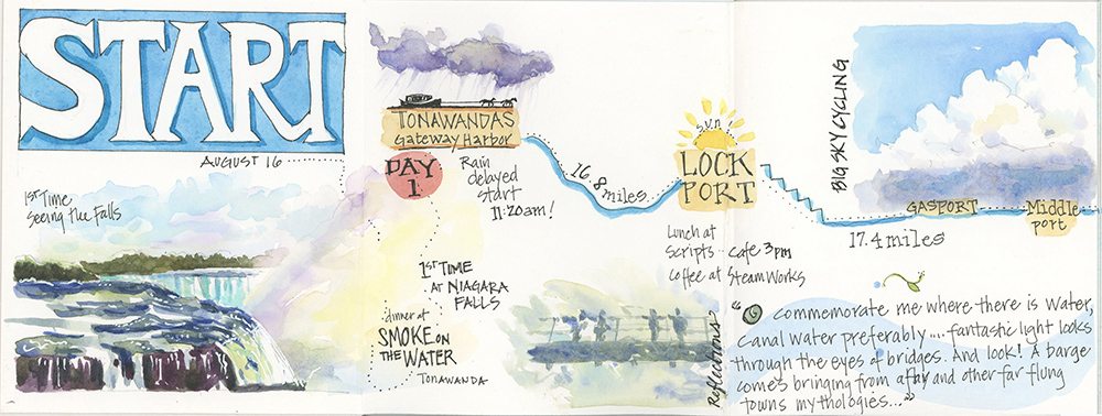
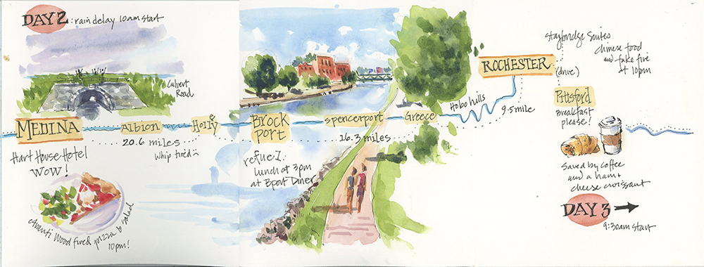
Last weekend, I competed a 100-mile cycling trip along the Erie Canal in Western New York. My husband and I, and three other couples, began in Tonawanda near Buffalo and headed east, ending a bit past Rochester. The off-road Canalway Trail follows alongside the canal, and there are quaint villages and impressive locks, bridges, and other canal structures to see along the way.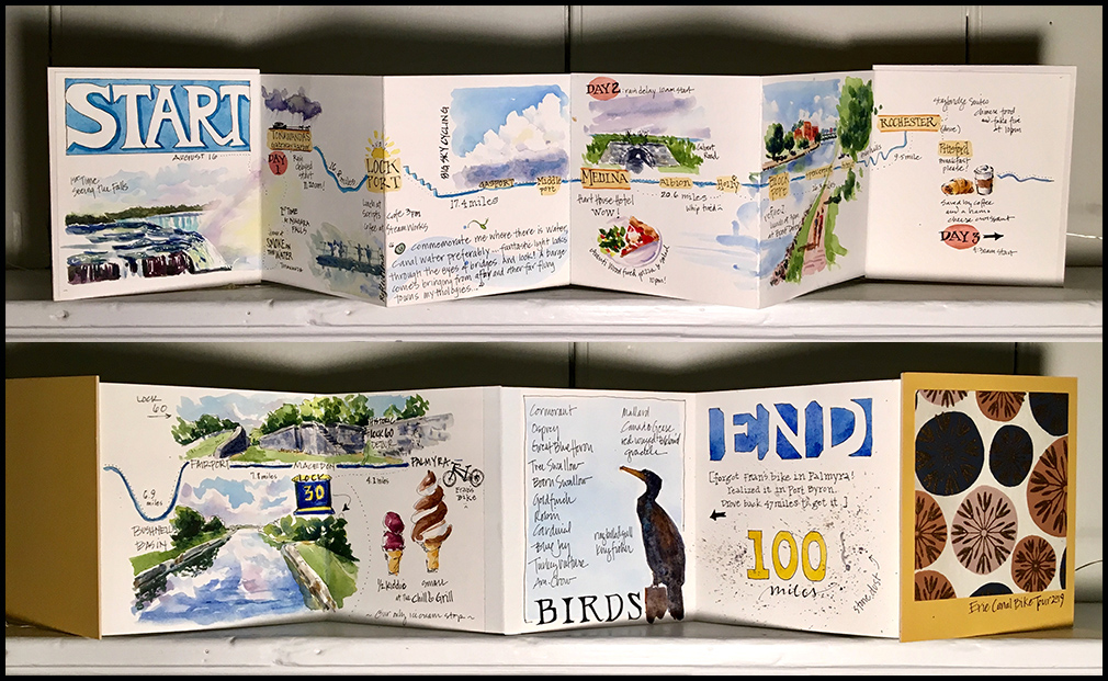
I made a small accordion-fold journal (4.5″ x 4″) that tucked into my bike bag so that I could record highlights of the journey. The long, horizontal format of the journal lends itself well to capturing a sense of the linear trail. Unfortunately, that format is not so good for showing here, so I separated the pages to give you a better view. (Click to view larger.)

Tips and Techniques– Truth be told, I find it very difficult to make time for sketching with a lot of miles to cover. I tend to make a few notes as I go, and sketch at the end of each day, using photos to fill in the gaps. The end result is a bit of a jumble, but it’s fun to look back later and see some of the small things that photos can’t capture. If you are traveling, try not to worry about making perfectly beautiful pages or filling a big sketchbook. A few small sketches and notes might be just enough to bring back your most memorable experiences.
Glory Days
These are the days we long for in the dead of winter: light-filled, warm, colorful, vibrant. Glorious.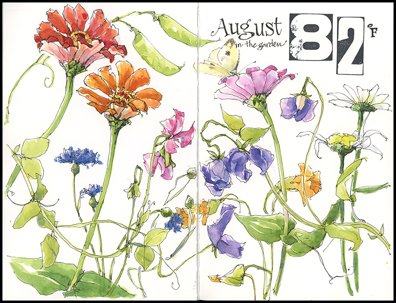
This painting began last fall when I had the idea to build an Art Garden in our yard. I didn’t want a garden that I would spent a lot of time working in, as much as a place I would enjoy being in. My chief criteria for what goes in the ground is that it must be something I want to paint. This has turned out to be an eclectic mix of vegetables and flowers—beets, radishes, and tomatoes are at home with sweet peas, poppies, scarlet runner beans, and sunflowers. Something new unfolds each week. And as you can see, it’s a pretty colorful place right now.
Tips and Techniques– I started by drawing zinnias and a few sweet peas but, after adding color, I quickly decided that the page was much too sparse. After all, August is all about abundance. So I went back and added more and more until the page was crowded with flowers. The lesson here is not to be afraid to pause when sketching to consider what drew you in and whether you have captured it. It may be a something particular about your subject or it could be a mood or feeling. Once you’ve got that in mind, finishing the drawing, or adding color or text often flows with ease.
Watercolor Artist – Open Book
I am excited to share with you that Watercolor Artist Magazine selected one of my journal pages for its Open Book feature in the October issue. Each issue looks inside an artist’s sketchbook and includes one page and a bit of insight from the artist. The October issue is full of terrific articles on plein air and nature painting, so this is an ideal fit. I’m honored to be included!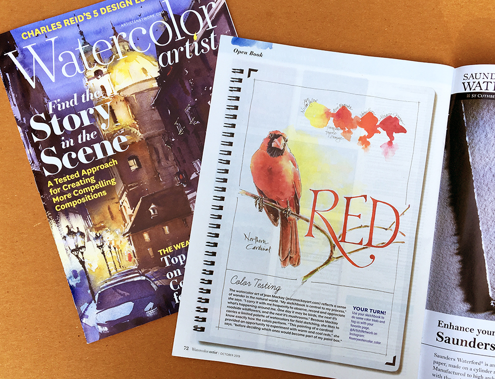
Transition
When I left Hog Island Audubon Camp, I stopped along the winding road that leads away from the coast and back into town. There is a glorious field of lupine along the roadside that I never have time to stop at when I am arriving. Even though the flowers had faded, I didn’t want to let them go. The seedpods and grasses shone in the morning sun. I wasn’t yet ready to leave. This page marks the transition from Maine to New York, from two weeks of immersion on the coast to the longing for it that always comes afterward.
Island Inspiration, Part 3- So Much to Paint
“Who can imagine my dear country’s dark woods, it’s vast Atlantic bays, it’s thousands of streams, lakes, and magnificent rivers? I wish that I could draw it all.”
–John James Audubon
I couldn’t agree more. During my art retreat on Hog Island in Maine I felt like I was hiking in the Cathedral of Nature. I was in awe of the island’s moss-carpeted forests, its milkweed fields alight with monarchs, and its waist-high ferns growing wherever storms had created openings to allow in more light. Osprey circled above the spruce spires, while hermit thrush, northern parula and black-throated green warblers echoed in the shadowy woods. I wished that I could draw it all.

Click any image to view larger.


Tips and Techniques– The greatest challenge to these paintings was undoubtedly mosquitoes. They own the Maine woods and bogs in summer. I stuck to sketching on trails close to the shore and had to skip drawing in the forest interior. The exception I made was to sketch in the bog. There, I worked directly in ink to capture the flowers and a few plants. Then I snapped a couple of photos and retreated to paint later in the comfort of my cabin. Some challenges are worth it.
Island Inspiration, Part 2: Birds!
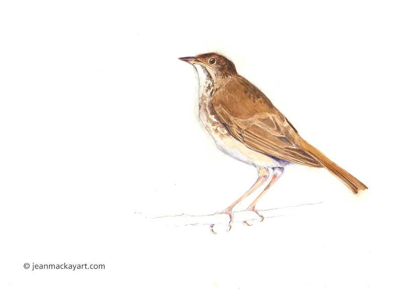
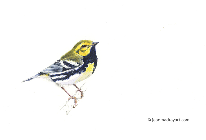
The Hog Island Audubon Camp has an incredible lab with hundreds of specimens and bird study skins. What makes it extraordinary is that camp participants and staff have access to it all. Drawers of mothball-laden cabinets reveal many treasures: bird eggs, wings, feet, skulls, and whole birds. I love using the collection to study birds up close and to teach Arts and Birding participants about bird anatomy. This year, I chose two birds that are frequently heard but hard to see in the island’s spruce forest—hermit thrush and black throated green warbler—and used a combination of video and study skins to bring them to life on paper.
I also found the remains of a gull skeleton while hiking and made a careful study of the wing bones, which will serve as a useful reference for sketching living birds.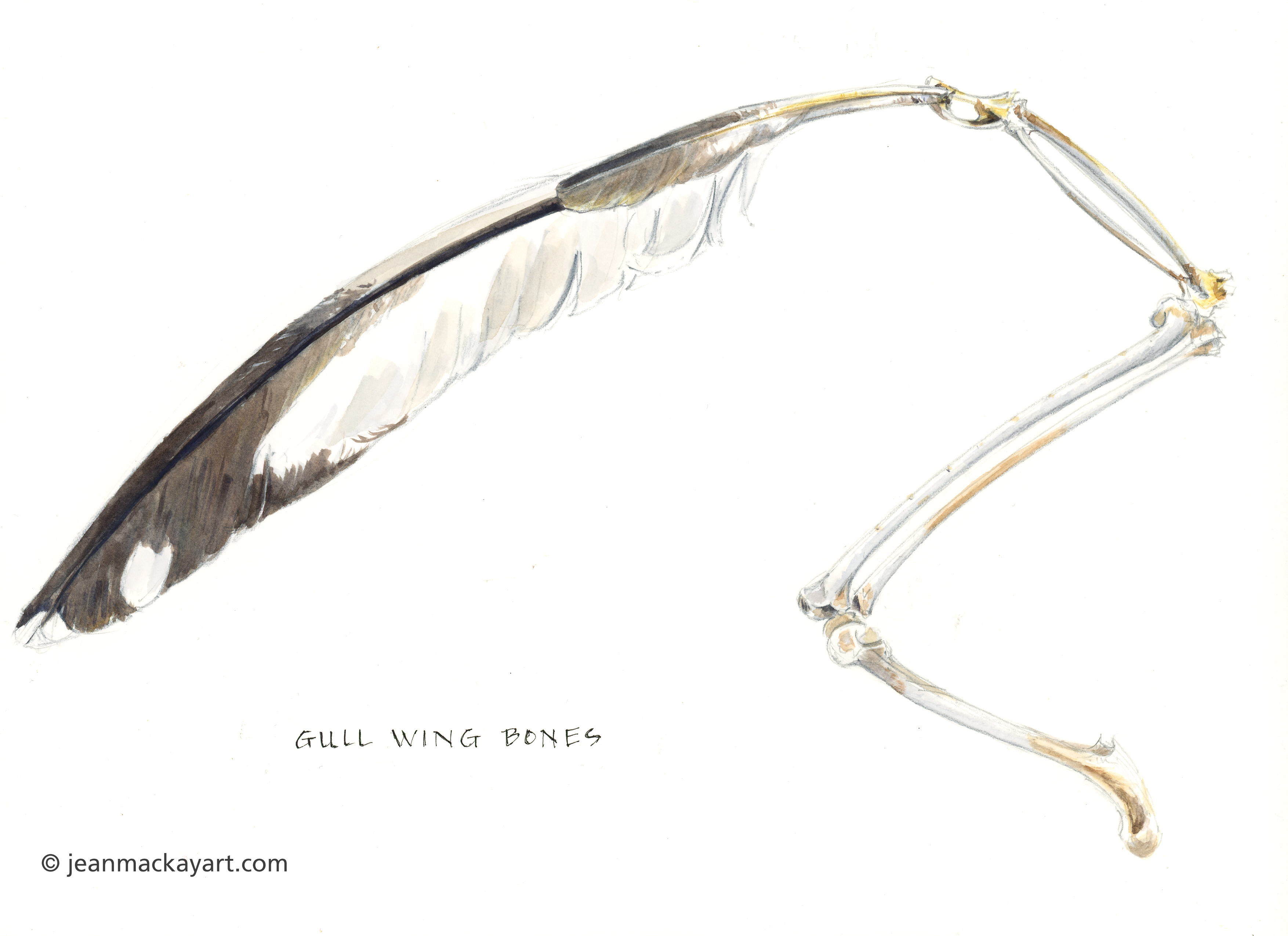
Tips and Techniques– If you want to improve your bird drawings, I highly recommend studying bird anatomy and feather structure, and looking at stuffed specimens or study skins. Many museums and nature centers have collections that you can request permission to look at. You’ll be able to see key features up close and sketch details that you can then incorporate into subsequent bird artwork.
Island Inspiration, Part 1
The rocky coast of Maine is a place shaped by granite and water. It is a landscape of quiet salt marshes, tidal bays, dark spruce forests, and hundreds of islands. It’s a place where the cries of seabirds overhead meet the ethereal songs of forest birds hidden in deep shade; and where people have made a living fishing for cod, haddock, lobsters, and shellfish for thousands of years. I have had the privilege of spending the last two weeks there at the Hog Island Audubon Camp, located on a 330-acre island nature preserve near Bremen. I spent the first week teaching and directing a five-day workshop called Arts & Birding; and stayed a second week for an art sabbatical.

“Use what talents you have, the woods would have little music if no birds sang their song except those who sang best.” – Oliver Wilson
It was a pleasure to have such enthusiastic and talented participants for Arts and Birding. Every day brought new adventures: island hikes, boat cruises to see puffins and other seabirds, intertidal exploration, studies of bird anatomy, osprey banding, and sessions focused on drawing, painting and photography skills. A daily salon gave everyone a chance to share their artwork and photographs in a relaxed and supportive setting.
What follows are my sketch-journal pages from Arts and Birding, with brief comments in the captions (click any image to view larger). Watch for subsequent posts from my arts retreat week.


If this tempts you to attend Arts & Birding or other workshops at Hog Island in 2020, mark your calendar now! Arts & Birding is tentatively scheduled for July 19-24 (registration opens October 21, 2019).
Rare Treat
If I were to ask you to name the top five birds that you see most frequently and to make a list of birds that are your favorites, I suspect that only a few, if any, would make both lists. My favorites tend to be reserved for birds that are especially colorful (rose-breasted grosbeak), tuneful (wood thrush, winter wren), beautiful (American avocet), or that I see infrequently because they are associated with unique places or habitats. This weekend, I had the opportunity to enjoy two birds in that last category during a trip to the Massachusetts coast.
Bobolinks and least terns are rare treats not only because I see them only about once a year, but because populations of both have been in a free fall for the last 50 years. The number of least terns in North America has declined by 88% since the 1960s; bobolinks declined by 66% over the same period. For both, the loss of breeding habitat is the main culprit. Least terns nest on sandy beaches where they compete with beachgoers and encroaching development; bobolinks need large grasslands and undisturbed fields, which are also ripe for housing developments or where mowing takes place before young leave the nest. I was fortunate to see both least terns and bobolinks thanks to the work of conservation agencies and organizations who are working to protect nesting grounds and stem the downward spiral.
More rare treats ahead: I’m heading to the Maine Coast at the end of this week to begin my annual trip to the Hog Island Audubon Camp. There, I’ll teach Arts & Birding and see Atlantic puffins, which have been brought back from local extinction by the work of conservation biologists stationed at Hog Island. I plan to immerse myself fully in the program and the place, so you may not see another post for a few weeks. I promise to make up for it upon my return.
When Peonies Bloom
When peonies bloom, rain nearly always follows. And so it was that I lost my subject. Still, I am pleased to have June’s most elegant flower in the pages of my sketchbook, a few cut flowers on my table, and pink and white petals littering the garden.
Tips and Techniques-
What you don’t see on this page are all the test sheets of greens that I’ve been working on this week: blue and yellow combinations, “convenience” green combinations (sap green, phthalo green, green gold), greens with browns, and greens with reds. I’m looking for highly transparent mixes that offer a good range of light to dark values. The trick is that when I’m working on a negative painting like this, I want to let some of the colors mix right on the page—and some greens are just too garish for that. What I (mostly) ended up with here is phthalo blue, nickel azo yellow, and a touch of quin magenta. If you struggle with greens, I highly recommend doing color tests of your own. You’ll quickly discover lots of combinations that don’t work and many that do. And you’ll gain confidence in your colors that will serve you well in your future paintings.
If you have go-to green combinations that you especially like, leave a comment so we can learn from each other!
Along the Roadside in June
Last year I made several sketching forays out along the country road where I live. I’m curious to discover what’s in bloom and find that almost nothing is native to the Northeastern U.S. Still, I have to give these invaders credit. They have traveled across continents and persisted in harsh conditions, yet still offer beauty and color where few other species would survive.
Tips and Techniques– When I head out along the road, I typically bring only my sketchbook and a pen. There isn’t much traffic, but what comes along is moving fast, so I have to be ready to move quickly. I walk along until I find something in bloom, sketch it, and move on to find the next roadside flower, filling the page as I go. I make mental notes about color and sometimes snap a photo for reference as well. When I come home to paint, I’m not just coloring in spaces, I’m also thinking about the mood and feeling of the day. This walk was sunny and warm; hence the overlay of yellow to tie everything together.


