Two Terns
Out of the fog the terns come calling. I hear their chatter over the waves before I see them, and then, there they are, rapid wing beats passing overhead. More emerge from the mist. They hover over the water and then fall from the sky, striking small fish below the surface. As luck would have it, I’m at Gooseberry Neck this morning, a small spit of an island in southern Massachusetts that attracts seabirds, shorebirds, and songbirds to its open water, rocky beaches, and shrubby interior. I’m grateful to be in the wilder world of ocean and sky; grateful for terns, before the sun and the rest of the day breaks through.
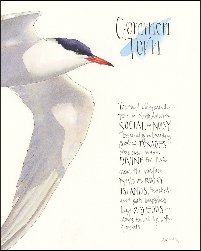
I painted these two terns for my Seabird Portraits class, experimenting with different color palettes and layouts. I’d be curious to hear which you like better.


I love them both! The one on the left because the colour is true, but the one on the right is my favourite because the colours are more adventurous and lively – thus contributing so much more to your capture of the nature of the bird, it’s vibrancy and energy. Love the eggs, too.
Thanks Sue- I often like a stark background, so it was interesting to add the sky on the right and figure out how to get eggs on the page without them floating in the air.
They are both beautiful. I like the one on the left, though the sky background on the right gives a nice context and the eggs are fabulous.
Thanks Cathy!
We frequently camp on a Breachway in Rhode Island where I’ve watched these birds flying about and wondered what species they were-now I know! These paintings are lovely, and so is your writing. You can “paint” a beautiful picture with your words.
I hope you continue to see and enjoy these birds in Rhode Island. I love watching them drop out of the sky for a fish– sometimes nabbing one and sometimes coming up empty.
Both are wonderful! I like the overall look of the right, and really like the style of the title and descriptive text of the left one with its capital words standing out. The eggs are terrific!
I did the one on the left second and the design benefited from doing the one on the right first. But I traded the color and eggs for it.
I think both are lovely. The one on the right looks more like a painting.
Thanks Liz. The background color makes an interesting difference.
both are lovely in their own way. I think the one on right is more dramatic!
Thanks Betty– It’s interesting how the background and shadow colors change things.
I love them both. The one on the left is softer and more as I see them, the second more eye-catching. It would depend on where you were painting them, with what goal. Love ’em! Thank you! ~Janice
Thanks Janice. It’s interesting to see what the play of color does to the same bird pose.
Hi Jean, I love both…I love your notes and emphasized lettering in the first (white background); I love the Blue Sky/clouds backdrop and the box with additional sketch of eggs…if I had to choose one over the other I guess I would choose the second. Your sketches are beautiful and so well laid out with such perfect lettering. Thanks every time…I look forward to your post every week. Linda
Thanks Linda! I like the text on the left one too. I did the one on the right first and wanted to try getting eggs, bird, and text on the page. Were I to do a third, I might combine elements of both of these.
I prefer the one on the right. The blue background is lovely, and I like the addition of the eggs. The white background is more stark. I guess it all comes down to personal preference and the message that you want to convey.
Thanks Peggy!
Ah yes — I spent many, many happy hours there. It’s nice to be reminded.
It’s such an interesting place– and such a mish-mash of things going on there. But if you’re early enough, it’s all about the birds and the sea.
Prefer the left. Right feels too busy and too much effort to read. Right invites involvement with viewer. Poem is art in itself.
Thanks Linda! I did the one on the left, in part, because I thought the information on the right was too crowded. The space on the left is better.
Agree with you. Alan was hoping to see you in Herkimer last week
Sent from my iPhone
Sorry to miss Alan. I wanted to go, but had a conflict with another meeting that ended at 3pm. My best to you both.
oh to be torn! If I had to make a choice, I love the tern with the blue background. The bird pops off the paper. But I do love the very clean appearance of the tern on the left ….. his colors are gorgeous, as is the lettering. But oh no, then there’s the addition of the pair of tern eggs on the same page with the blue background bird. The composition you created for both is very pleasing too. I’m still torn though. If the blue background bird’s watercolor washes were in grey, hands down that would be my favorite. Such a conundrum! About your blog narrative ….. captivating! You created tension and mystery as the birds approached through and out of the mist. And they knew exactly where to land! Jean! Absolutely wonderful!
Thanks Barb– You are always so positive and thoughtful in your observations. I appreciate it!
Hi Jean, They are both gorgeous…if I had to choose I’d say A…. if you could squeeze an egg in between the writing and the wing.
Greetings from Queensland Australia,
Marylin Smith
Sent from Mailhttps://go.microsoft.com/fwlink/?LinkId=550986 for Windows
I would have had to plan for the egg rather than squeeze it in, but I do enjoy doing the eggs. Thanks for weighing in!
I actually like the clean look of one on left. Like the info given and the subtle shading of grays and browns against white background.
Great use of blue , as indication of sky and water, in one stroke!
Thanks for recognizing the sky in that stroke of blue! Having just seen them come out the fog, the white backdrop is not unrealistic. Neither is the blue. Perhaps I need to do a third piece that takes elements of both…but I’m now onto doing a tern chick and I have a Northern Gannet mid-dive waiting for me to finish.
Hi Jean, I loved your Vinalhaven paintings. My siblings and I have a home on Seal Cove and go up many times in the summer. I purchased your book a few years ago to share with my nature journaling group so I am a fan. Of course, I would love to take your course on V. H if you do it again. How do I sign up, sincerely, Katrina Walton.
Hi Katrina- I bet its quite beautiful and quiet on Seal Cove. The workshop on VH was advertised through the Vinalhaven Land Trust and in The Wind. They didn’t have a sign up. If I do one again, I’ll also post it on my website workshops page. I’m not sure what my schedule is next summer or whether a program will work out through VLT, but I hope so! Stay tuned. Thanks for your support– I hope you’ve enjoyed nature journaling on VH!
I’m always about light and color, so (R) tern is the one for me! Light and shadow give dimension and depth to the R bird and chase away any feeling of looking at a museum specimen! Thanks for the periodic joy of your watercolor field notebooks
Thanks Carol- I appreciate thoughts on the terns.
Hallo again…are you still down here? I’m just across the MA/RI border in Little Compton, and would love the chance to see you IRL and take you over to the Arts Cafe at the Commons for an iced tea or…if your schedule permits!
Cheers – Carol
Hi Carol- So sorry to say that we were just there for the weekend and now are home in NY. Little Compton is a lovely area and I would have loved to meet up. There’s such an active arts community on the Southcoast. Thanks for the invite– I’ll take a raincheck. Maybe I’ll make it back in the fall. –Jean
You’ll be back again no doubt, in a month or a year…hope to see you then!
I love the first one so very much!! Clean, bright and graphic. Super fitting for tge stark contrast of the bird’s coloring. And the image is a perfectly balanced with the text block. Love your layouts, Jean!
The other seabirds in series are on a clean background so I wanted to see what this would be like that way too. The composition is better balanced on that one, too. Thanks for your feedback!
Both are beautiful! But if I have to make a choice I favorite the one on the left! I love the clean one look I capture all! Beautiful lighting and the black and white contrast. I also like the font for the writing section. I always love to see your sketches!
Thanks Carolina! I appreciate your thoughts. It’s been interesting to get a variety of responses.
Both look wonderful, and the colors are exactly what my eye sees through a camera… the bird on the left on a softly overcast day, and the bird on the right on a bright sun-lit day. When I have a choice, I opt for shooting on cloudy days so that the glare (especially on white feathers) doesn’t obscure details like the eye and feather structure.
Interesting perspective, Sam. THanks!