Imperfect
What is the value of imperfection? I’ve been mulling over that question as it pertains to artwork for a few years and still, I don’t have a clear answer. I love the work of natural science illustrators, for whom accuracy, precision, and beauty are paramount. Yet each time my own artwork approaches that kind of perfection, it somehow seems to be missing something. Embracing imperfection, which, after all, is what so much of life is about, increasingly appeals to me. Letting go, accepting, and finding beauty are good lessons to learn on any journal page—and these lilies, way past their prime, were the perfect teacher.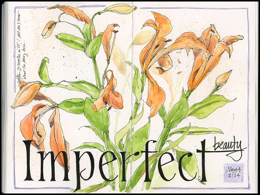
Tips & Techniques– This piece takes advantage of secondary colors—orange, green, and a spot of purple—to create harmony. The strong black of the text, done with a Micron graphic pen, nearly overwhelms the lilies, but also makes a strong statement. I could go back with a thicker black outline on the flowers, but that would likely lead to overkill.

Beautiful work – and perfect as is! So very inspiring.
Thanks Gaelle. Always glad to inspire.
I love your imperfect Jean. And the secondary colour palette.
I thought it was interesting to see your post on tulips last night…same theme. Now I’m turning my attention to the 100 people challenge– I barely see 100 people in a week, so drawing 100 is going to take some work!
It was funny to see your work too, after I had just sketched the tulips. Will you be posting your people sketches?
I think I will post them all next weekend and maybe some during the week on Instagram.
you’re right…its beautiful as it is
Thanks Stacey!
Beauty is sometimes most prominent in imperfection. This artwork is incredible. 🙂
It seems like we place so much emphasis on the “perfect” that we may miss the imperfect beauty that is often staring us in the face. Thanks for your insight and very nice compliment!I always appreciate hearing what folks think.
They look perfect to me 🙂 love the loose feel.
Thanks…that’s the funny thing about imperfection– it often seems… well… perfect.
Perfectly imperfect as is!!! I like the natural state of these lilies and as usual your lettering is stunning. Thanks for posting. Have a good day.
________________________________
Thanks Carole- you are such a nice “fan.”
I love it! I agree with you so much about perfection. I used to only paint photo-realism, but more and more, it feels almost cold and digital when I do that. I love the accidental (or not) drips and splashes, the extra pen lines, the unfinished quality where you have just enough information. It leaves something to the imagination, and allows the viewer to dream and wander through the painting.
Well observed! I think there is value in both the messy and the well finished– and in the combination of the two. But I, too, have needed to liberate myself from striving for the perfect in favor of allowing others to wander through my sketches.
Always a tussle – I find – between drawing as observation and letting go of ‘the line’…perhaps the two are intertwined.
Do you usually draw in ink first and then paint in, or vice versa. Love you imperfect.
Always draw in ink first, then paint…or pencil then paint. Glad you liked this!
gorgeous work! the ink and lines, and color just look so beautiful. I do love botanical art 🙂
and of course, “Imperfect” is one of my fav words along with ‘wabi sabi’ 🙂
Hi Deb– I like Wabi Sabi too!
I just thought you Might!! lol 🙂
Funny, when I saw this sketch, I thought, I’m going to have to ask Jean how she decides on the lettering for each page. And then I read your text that it may be one of the things you questioned about this piece. I love hand lettering, but deciding on a style for a sketch sometimes drives me to distraction. I like the starkness of the black with the soft, delicate lilies here.
I finished the flowers and then decided to do some big text on this one. Sometimes I lay tracing paper over the page and test some styles, but in the case I knew I wanted it big at the bottom.
I find brown or terracotta colors softer and less detracting on a journal page.
Thanks Jill- I always like the way those shades look, though I seem to struggle with them at times myself.
It’s always a good morning to find a new sketch and inspiration from you! I love the bold graphic of the text, to me it works perfectly! How very ironic.
The irony here is that you had to worry about “perfect” to indicate that your flowers weren’t 🙂 Thanks for the short discussion of your color harmony choices. That stuff is still a mystery to me and I’m trying to learn it.
I know Larry…it is ironic, but that’s the tug for me. I’m glad I mentioned the color choices– I learned most of what I know years ago, but I do come back to it with some frequency. It can make a subtle, but nice difference.
I do believe that perfection is too cliche. I mean if everything were perfect, then all lilies would be alike and all roses would be alike and all people would be alike. We would be like factory-manufactured goods! That, my friend, cannot be beauty. So thank God for our imperfections
Thanks for sharing your thoughts! Here’s to imperfection!
Perfectly IMPERFECT. This is what I love. I love all your artwork.
Thanks Erica. Imperfection is a concept I’ve been thinking about a lot over the past couple of years — in life as in art — it seems to work. Thanks for sharing your kind feedback.