Back to the Drawing Board
A month ago I posted a drawing of an enormous hornet’s nest that took both a considerable amount of time to draw, as well as space on my kitchen table while doing so. Shortly thereafter a friend suggested that I had drawn it upside down! The opening on a hornet’s nest is typically at the bottom which, apparently, helps keep rain out, and I had drawn it at the top. Solving the problem wasn’t a simple matter of turning the drawing around— the shading and composition simply didn’t hold up when the drawing was flipped. So, with reluctance, I went back to the drawing board, as they say, for another go.

Graphite, 18×24″
Tips & Techniques: Although this piece took just about as long as the first one—15+ hours over the course of two weeks— I was able to take what I learned the last time and push the drawing further. The best part of doing a complex and subtle piece like this is that it forces you to really look at and replicate a full range of values from light to dark in order to get the object to take shape on paper. I used 2H, B, 2B, 3B, 4B, and 6B pencils.
Whether in black and white or color, I see artists struggle with values all the time. Failing to save the lights (in watercolor, the white of the paper) or being too timid to push the darks frequently leads to a flat drawing or painting. If that is something you have difficulty with, I recommend making a simple value scale with a variety of materials, including pencil, pen, and paint. Here’s a very simple scale, with just light, mid-tone, and dark. You could do a range of five or a full scale with many subtle tones to practice.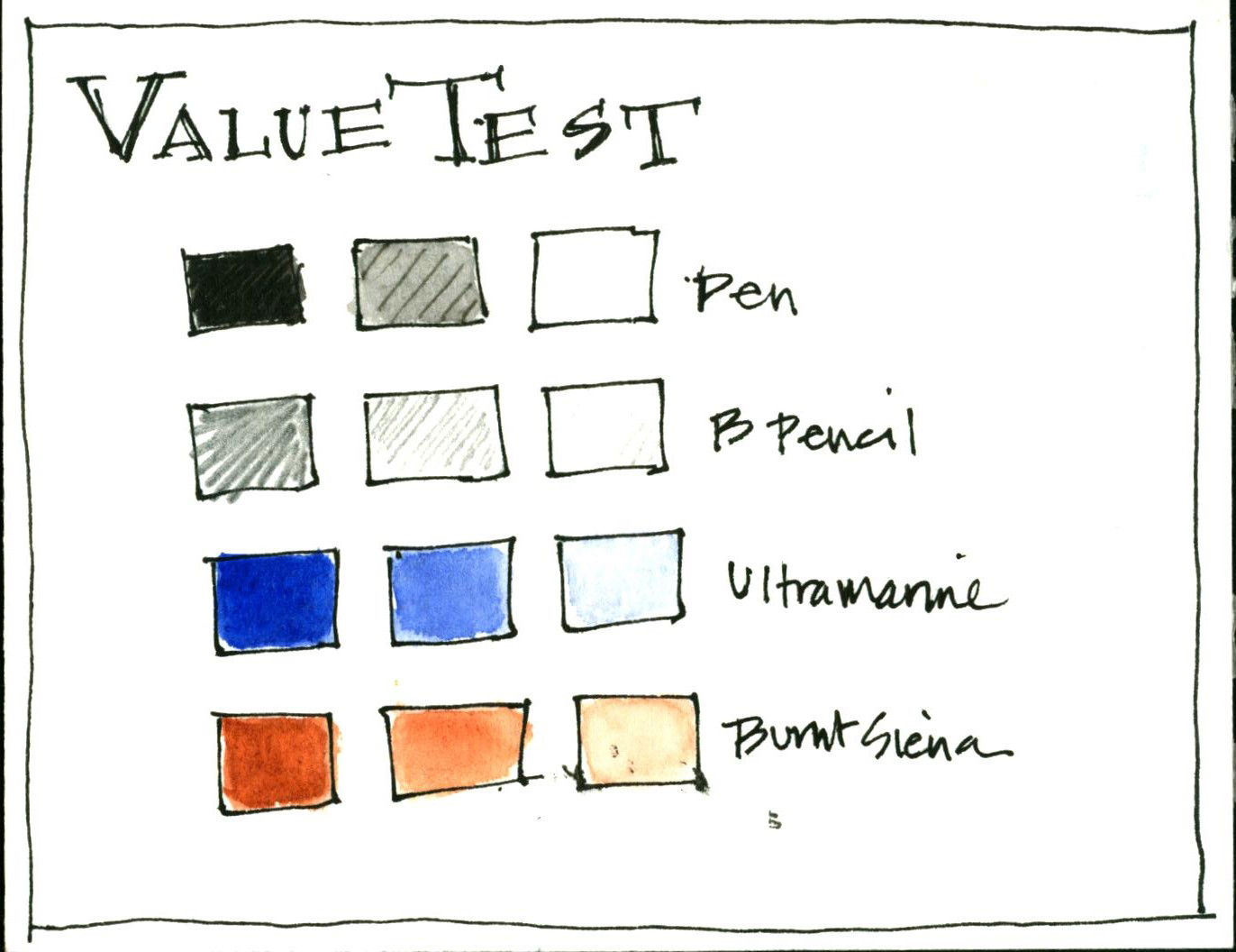
Keep the scale handy as a reference. Hold it up next to a drawing or painting you are working on and check whether you’ve got a good range of light to dark. If not, go back to your subject and look again. With practice, you’ll start to see and incorporate a full range with confidence.

Reblogged this on Inspire and commented:
A good article on the need to see values (the artistic kind} in all the art work we create. Unless you’re creating a monochrome painting values help a painting pop.
Thanks Timothy– glad you liked and shared the piece.
It’s a pleasure to look at such intricate and graceful work. Your nest is beautiful. And I realized something new about hornets’ nests. Of course the opening is on the bottom! Makes perfect sense.
Thanks Susan. Always more to learn, eh?
Lovely drawing.
Thanks Sherry!
Helpful, Jean. Thanks!!
Good! I’m glad. Keep it up!
Your drawing is spectacular and your comments are spot on. I am always struggling with seeing, learning to interpret and making my work come alive. Thank you!
Thanks Julie- That’s always the challenge of the artist. I love seeing, learning, discovery, and the process of trying to create on paper. Let’s keep at it!
very interesting !
Yes…it’s quite a specimen!
Fantastic drawing!
Thanks!
What a great drawing – I love the intricacy of it, not to mention the textures. You are absolutely right about getting the values right, they can make or break an artwork.
Thanks Anna– I enjoyed poking around your blog. Right up my alley in terms of subject, book making, sketchbooks. Glad you found me and happy to make a connection.
I knew I had found a kindred spirit when I found yours! Looking forward to following you.
Likewise! I’ll enjoy seeing the things you discover and it will be fun to see how you handle similar subjects.
I like your suggestion to practice a value scale in w.c. and graphite.
It’s a useful exercise! Plus you can really see how you can maximize your art supplies.
You did a fabulous job! Learning to see values isn’t easy, but your tones are superb!
Thanks Harrison! Looks like you’re doing pretty well with your sketchbook, too.
Thank you!
great drawing! and very helpful tips 🙂
Glad you found it helpful! Thanks for following!