
Gone, but not forgotten
The woods are falling silent. Save for the call of jays and crows and the occasional chatter of chickadees and nuthatches, our songbirds have all flown to summer in the southern hemisphere. So, while it may seem odd to be painting yellow warblers in November, I am not quite ready to take up brown and blue paint and focus on winter birds just yet. This painting began in the Yale Peabody Museum of Natural History, where I recently sketched yellow warblers perched in display cases. Back at home, I worked from those studies, a variety of photos, and a previous painting of dogwoods to create this piece…a bit of spring to tide us over the long winter ahead until these little beauties return.

Yellow Warbler (female), watercolor on Fabriano soft press 140lb paper, 6”x8”; click to view larger
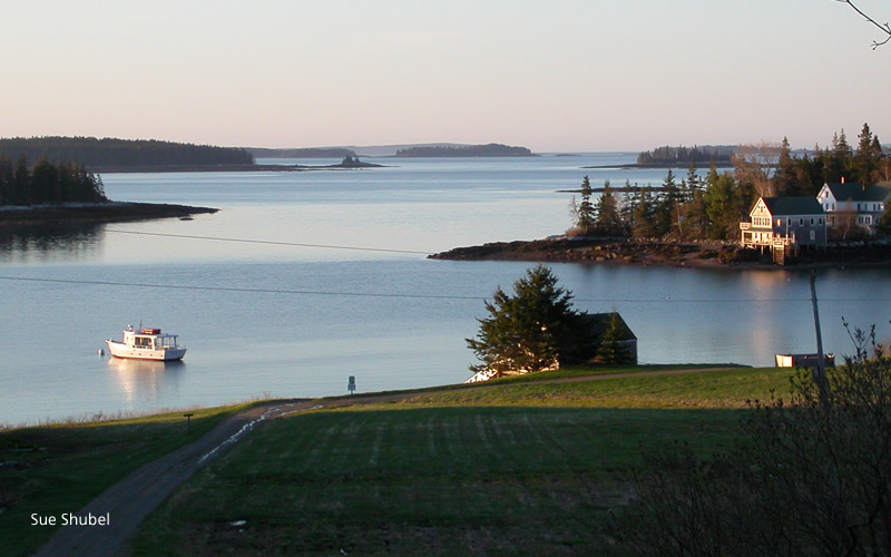
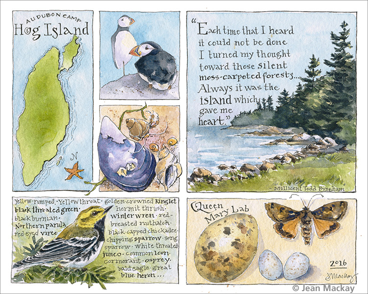
Arts & Birding– If you like birds, nature, and art, and are looking for fun workshop to improve your skills in either sketching/painting or photography, join me in Maine next June 11-16 for Arts & Birding. This workshop takes place on a beautiful island on the Maine Coast at the Hog Island Audubon Camp. Registration is open and spaces are filling quickly. This is a wonderful place to invest in yourself and your art!
![]() Many thanks to Discover WordPress for featuring Drawn In this week and thanks to all of you who signed on to follow me! Your enthusiasm, nice comments, and likes are terrific!
Many thanks to Discover WordPress for featuring Drawn In this week and thanks to all of you who signed on to follow me! Your enthusiasm, nice comments, and likes are terrific!
Tribute to Bates
For years I’ve been fascinated by the work of artists who traveled with the great natural history expeditions of the 17-and-1800s. Those artists worked in the most extreme conditions and with the most exciting of assignments: to catalog the flora and fauna of newly discovered continents. Among my favorites are Maria Sibylla Merian, who exquisitely captured flowers and insects of Surinam (1699-1701), Sydney Parkinson, who crossed the Pacific with the Endeavor and left behind nearly 1,000 finished and unfinished botanical paintings and sketches upon his death at sea (1768-1771), and the prolific Henry Walter Bates, who filled notebook after notebook with insects of the Amazon (1848-1862).

click to view larger
I’ve always wanted to do a page like this. I started during modest travels of my own, sketching in the cramped quarters of an airplane. I finished back at home, using specimens I had photographed at a natural history museum. No comparison to the working conditions of the masters, but a nod to those artists just the same. And if you’ve ever wondered how much variety you can get from different combinations of browns and blues, paint moths.
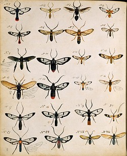
Henry Walter Bates, Insects of the Amazon

Henry Walter Bates, 1862
Runner Beans
The last garden vegetables left to harvest include a few scarlet runner beans that I’ve had my eye on since their red flowers bloomed in August. I didn’t make time to paint them then, but didn’t want to miss them altogether.

click to view larger
I sketched directly in ink and then added watercolor to the foreground layer. I went back in and painted an additional layer of light watercolor vines and beans to add more depth. The shadows are really important to making this work because they create the illusion of light and depth. Done in Stillman and Birn Zeta journal, 8.5 x 11.
Testing
“Don’t go over to the dark side!” warned a fellow watercolor artist when I mentioned wanting to try acrylics. But here I am, wading in. A familiar subject, a new approach. Using acrylics made me appreciate the lightness and delicacy of watercolor and the beauty of drawing that goes with it. But it also made me envious of the ease with which you can rework the paint and blend color on canvas.

Acrylic on gessobord, 8×8″, click to view larger
This painting is dedicated to the Artist Nest Group in Anacortes, Washington, who took risks, experimented, and pushed themselves repeatedly throughout the four-day workshop I taught last month. Rest assured, I won’t be trading my watercolors any time soon, but it’s good to try new things every now and then.
Fall Fruits
I went on a “sketch crawl” at the Connecticut College Arboretum last weekend expecting to draw trees. Instead, the “crawl” felt more like a race, as we were given 15 minutes to draw in a particular location before moving to the next site. Between hiking, settling in and packing up, there was precious little time for more than a very loose sketch and a hasty wash of color at each location. It was a good exercise, but I quickly abandoned the idea of doing a detailed tree study in favor of focusing on simpler plants.

click to view larger
Back at home,the warm-toned fall fruits and foliage just seemed too stark on white paper. I finished the page by adding the background wash of yellow ochre, which set off the baneberry’s white fruit nicely and helped to pull together the separate elements.
Simple Beauties
“Those who dwell among the beauties and mysteries of the Earth are never alone or weary of life.” – Rachel Carson
I love the way small creatures find refuge in and on one another in the sea. Kelp, bryozoans, barnacles, mussels– life upon life, tangled and cemented together. Tossed up from the depths, it’s a pleasure to find these beauties within reach.

140lb Fabriano soft pressed paper; hand-made journal
Upcoming Program:
Drawn In
Sunday, October 23, 2016, 3pm, Free
North Chatham Library, 4287 Rte. 203, North Chatham, New York
 I will be giving a presentation of my artwork as part of the library’s Arts & Literature lecture series. Take a look inside my sketchbooks and at my natural history illustrations and discover a world of color, inspiration, and a few surprises.
Goldfinch
In autumn, I like to watch for birds that are migrating south, but I also enjoy the rear-round regulars that visit our yard. With mating out of the way and young fledged, songbirds focus on the singular task of eating to prepare for the long, lean winter. A harvest of flowers gone to seed and fruit on wild vines, supplemented by bird feeders set a welcome table.
Drawing birds takes some practice and a bit of study to familiarize yourself with anatomy, feather groups, and the correct placement of legs and eyes. I spend time drawing birds from mounted museum specimens, study skins, and photographs, as well as from life. For a piece like this, all of those things combine to inform the finished artwork.
I typically start with a light pencil sketch so that I can refine the lines, and then add ink. I like a Micron 005 so that the lines are very fine and I can suggest feathers here and there. Then I paint a loose wash to map out major areas, followed by increasingly detailed layers of color and value. I go from a size 5 or 6 brush at the start and finish with a size 1.
The Ultimate Grid
A window seat over the American mid-west provides an astonishing view: a landscape of squares spreading in all directions. Striped in shades of tan and green with occasional non-conforming blue snaking its way between the squares, the American heartland is the ultimate grid. 
The pattern owes its existence to Thomas Jefferson and the Land Ordinance of 1785, which served as the basis of the Public Land Survey System used to divide property for sale and settling.
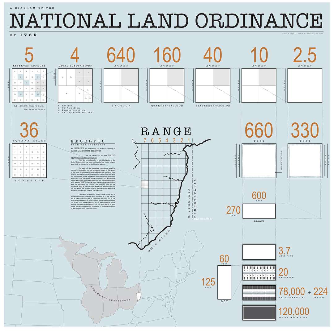
The Largest Landscape: The Grid of American Agriculture, from Architizer
I had been working with grids in my sketching workshop in Anacortes, and had already marked out a journal page for future use. When the view from the airplane on my way home presented itself, it was a perfect fit. I quickly sketched the patterns and later used Google Earth for additional reference.
Grids are frequently used for design because they provide a flexible framework that breaks the space of a page into related parts. I devised a 12 square 2-page grid in my 5” x 8” Stillman & Birn journal, with about ¼ in of space between the squares. The beauty of it is that the squares can be combined in numerous ways—long or tall rectangles, a larger box, and smaller squares. No matter the combination, the grid holds the design together.

 I find grids to be especially useful when I’m hiking or traveling and want to capture a number of experiences or scenes on a single page. You can fill a square quickly with a sketch and paint later if needed, so it works well when with non-sketching companions.
Lessons from a Carrot
At the recent workshop I led in Anacortes, Washington, we started off with some back-to-basics drawing and painting techniques. Participants practiced blind contour and gesture drawings; did short, timed sketches; worked in ink to keep a drawing flow going without erasures; and put a number of concepts together while painting vegetables. Here’s my demo painting, which I went back to later to add tips from the lesson. Isn’t it great that we can learn so much from a carrot?

click to view larger
Gone West
I’ve just returned from a week in the Pacific Northwest—land of big trees, mountains, skies, water, and wilderness. I had the privilege of teaching a four day watercolor sketching workshop with an enthusiastic and talented group of artists from Anacortes, Washington. I’ll share a few lessons from the workshop here soon…but first, let’s start where so many of my travels begin: with a map. It has been 30 years since my last trip to the Northwest, so this painting helped me to get a good sense of the lay of the land.

click to view larger
I had hoped to see some western bird species and was delighted that Anna’s hummingbirds were near daily visitors to the backyard where I stayed. I mainly saw the female, which is less colorful than the male, but no less interesting.
click to view larger
click to view larger
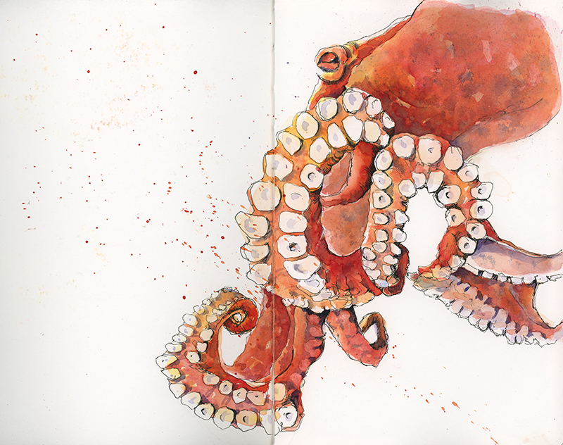
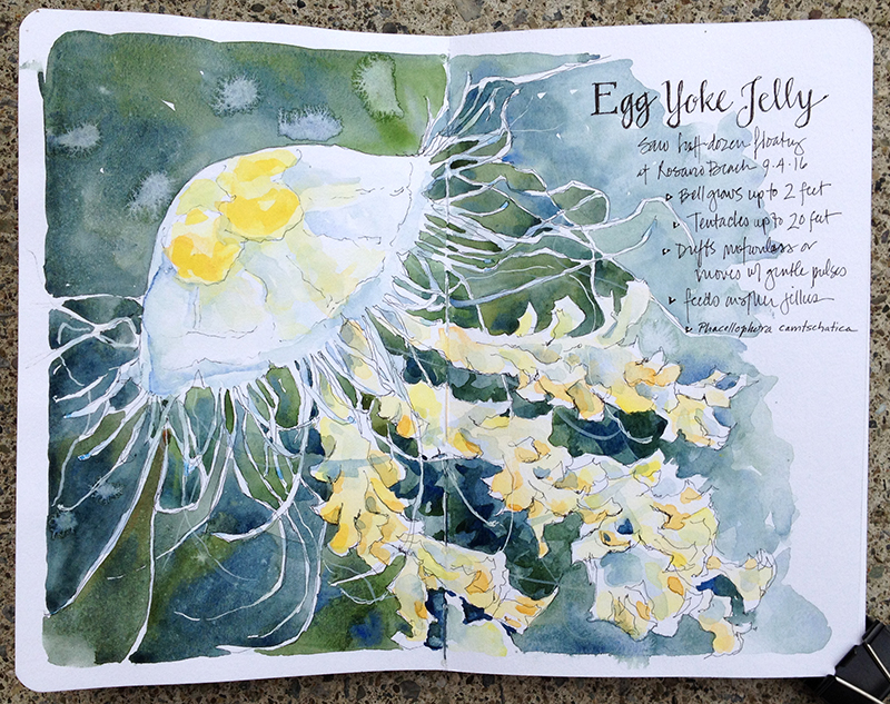
Before the workshop began, I took two days to explore and hike. I painted this octopus from a video in anticipation (i.e. wishful thinking) of seeing one in a west coast tide pool. No luck; but I did see nearly a dozen egg yolk jellyfish, a fairly common west coast species, as well as other fascinating denizens of rocky tide pools in the Puget Sound.


