
Spring Unfolding
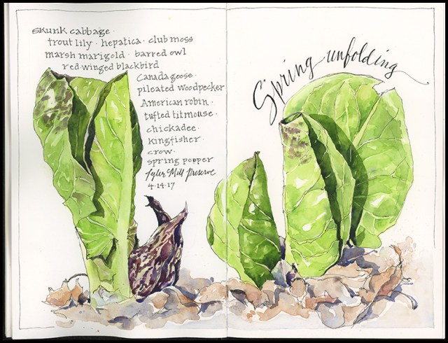
When the world has been brown for months, the first emergence of green is a wonderful thing. Skunk cabbage has been unfurling for several weeks now and is a most welcome sight along woodland streams and wetlands. In late winter, it sends up a maroon-striped spadix, which encloses its unpleasant smelling flower, and then in early spring it unrolls bright green leaves. I recently spent a pleasant afternoon sketching on the edge of a wooded steam, enjoying dappled sun and birdsong, and feeling grateful for this one beautiful color.
Tips & Techniques– Deciding what to sketch is sometimes harder than actually sketching. Likewise, figuring out what you want your page to look once you’ve chosen a subject may seem daunting. Here are a couple of ways to get past the blank white page:
- Option 1: Start with a couple of quick thumbnail sketches. These will help you figure out whether you like your subject enough to devote time to it and whether you think you can tackle it in the time you have. Thumbnails will also help you consider different approaches to page layout. They can help you map out where the lights, mid-tones, and darks are too, which will give you a road map for the full page version.
- Option 2: Just begin! Rather than thinking you have to figure out everything before you start, consider that your sketching journey can begin with a single step. Make a mark. Make another. Keep looking, keep going until you feel satisfied with the page.
- Option 3: Be thoughtful. Consider what drew you to sketch this particular subject. Think about it for a minute- was it the color? The light? The scene or object? The story? Your experience? When you have an answer, you’ll have a better idea of what to emphasize and how you want to approach the page.
Arts & Birding 2017
If you love sketching or photographing birds and nature, want to improve your skills, and have a fun week exploring the beautiful rocky coast of Maine, join me for Arts and Birding at the Hog Island Audubon Camp, June 11-16, 2017. Being in on the island as program director for this session is one of the highlights of my year! We still have a few spaces in both the sketching/painting track and the photography track— so please read on and consider being part of this incredible experience. Beginners to advanced participants are welcome!

 Photography Track– This session is scheduled at the height of bird nesting season, so you’ll have opportunities to photograph birds and chicks–including osprey, eagles, puffins, terns, and songbirds–at their most active and colorful time of year. In addition to birds on Hog Island, you’ll visit several mainland hot spots and photograph puffins and terns on Eastern Egg Rock while aboard the Snowgoose III. You’ll also be able to take advantage of magical dawn light and evening sunsets to photograph island landscapes. National Geographic Photographer Drew Fulton and former Boston Globe columnist and photographer Derrick Jackson will offer daily skill sessions and share their expertise in the field.
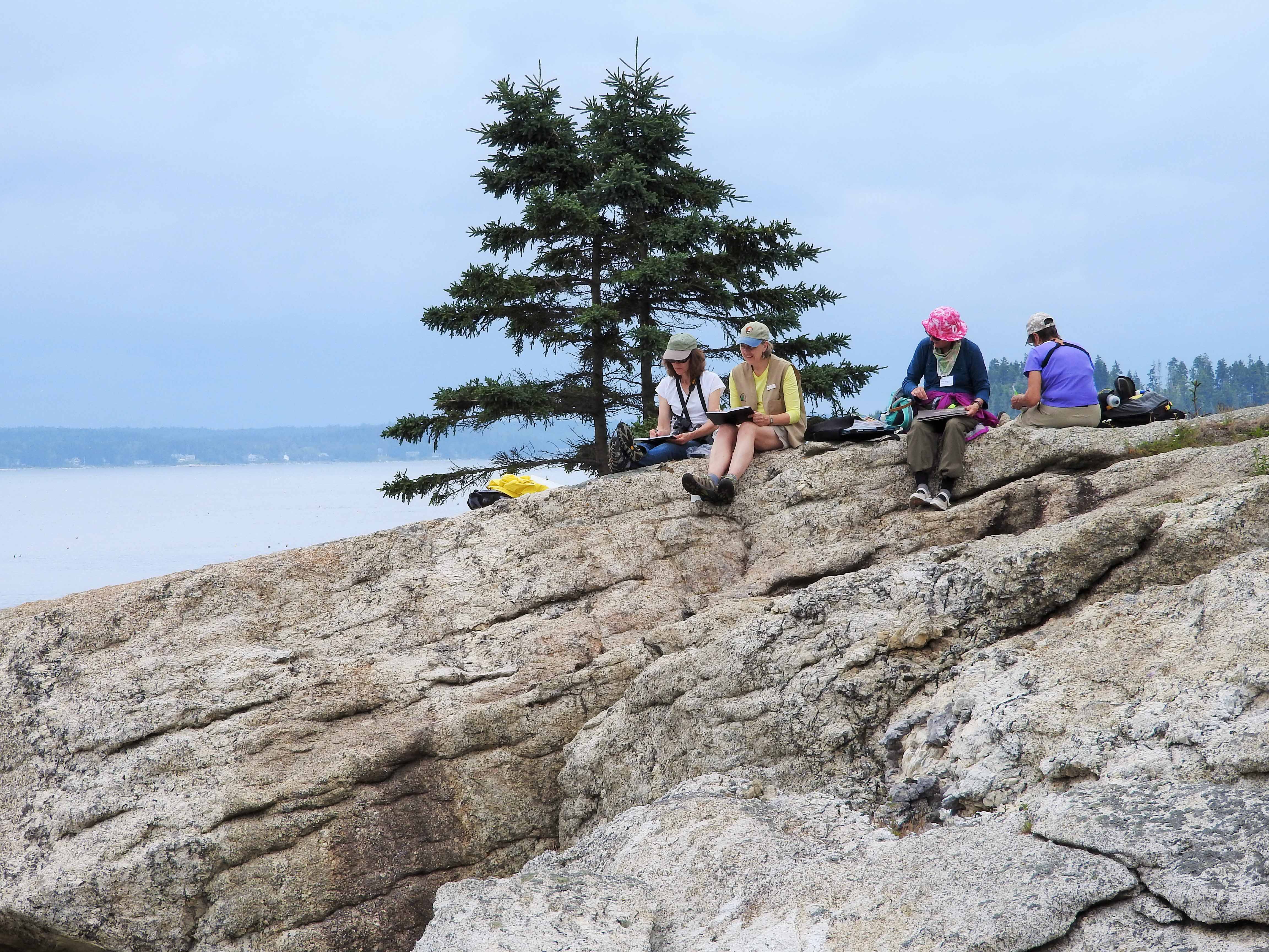
Arts Track– Come prepared to expand your skills in the supportive atmosphere of fellow artists and expert instructors—yours truly and fine artist and print maker Sherrie York. Hog Island’s quiet coves, rocky inlets, and old growth spruce forest provide opportunities for both exploration and art. Daily skill building sessions will cover techniques for drawing and painting, with a focus on nature journaling, birds, and landscapes.
About Hog Island– The island is just a short boat ride from the mainland, but it’s a world apart altogether—no cars, no shopping plazas, no houses, just 300 acres of Maine coastal spruce forest, rocky coves, and fantastic views in all directions. Handsome camp buildings that date to the 1890s, but updated with modern amenities, are concentrated at the tip of the island. This unique sanctuary has been offering education programs to adults and youth under the auspices of the National Audubon Society since 1936.
Visit the Hog Island website for additional details and registration, and don’t hesitate to ask a question in the comments or via email: jeanmackay(dot)art(at)gmail(dot)com.
Burst of Yellow
The forsythia is in bloom once again– a glorious burst of yellow– which led me to pull this from the archives. You have to click on it to view it larger for the full effect. Enjoy!

Salamander Migration
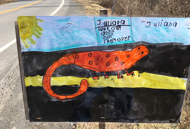
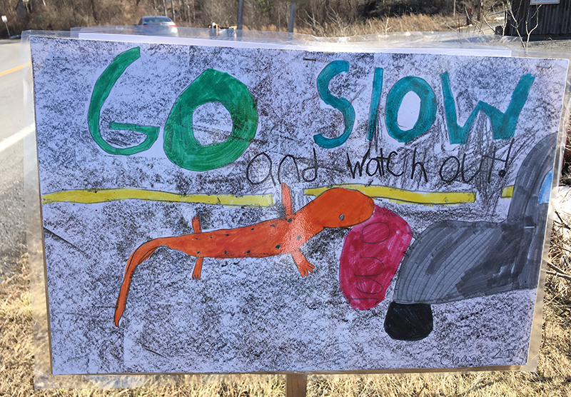
You may notice robins in the yard or the first buds on the elms or daffodils ready to pop. But one of the best signs of the turning season for me is when the salamanders migrate. It happens on the first warm rainy night in spring. Sometimes it’s March, sometimes April. But when it rains all day and into the night, that’s the time when several species of salamanders come out from underground in the woods, where they spend most of their adult lives, and head to wetlands where they breed. If you happen to live someplace where roads intersect their habitat, you may see them in your headlight beams, or squished and stinking on an early morning jog. Or, if you’re like me, you pull on your rain gear and head out with a flashlight and help them cross the road.
I used to round up friends and kids to go out for the annual migration. One year I paid my sons a dime for every salamander and frog they found and I had to pony up two bucks each at the end of an hour. My kids are grown now, but when they see a rainy forecast they still text me to ask, Is this the night? Some new kids put up these fantastic signs — I hope they were out there during this week’s rains, soaking up one of the greatest rituals of spring.
 Tips & Techniques- Don’t try to draw in the dark in the rain. Take a photo. I began this page with a pencil drawing compiled from two photos. I painted the yellow spots and used masking fluid to save them and some of the highlights. I then did a wet in wet wash of ultramarine blue, burnt sienna, and yellow ochre over the whole thing (the entire painting is just those three colors, with a touch of sap green and quin gold at the end). I used negative painting techniques for most of this, pulling out bits of leaves on the ground and the shapes of the salamanders.
A fine combination
“You mean, like, Sting, the musician?” the printing representative asked me when I told him that I needed my printing job to be just right because I was working on something for Sting and his wife, Trudie Styler. “Yes, that Sting,” I said. It’s just a very, very small project, but it has been a fun one, just the same. I recently painted and designed tags to hang on bottles of premium olive oil produced at Il Palagio, the Italian estate of Sting and Trudie. The oil is about to be sold in the United States and the northeast distributor wanted to add a tag to make it stand out more. Here’s what it looks like: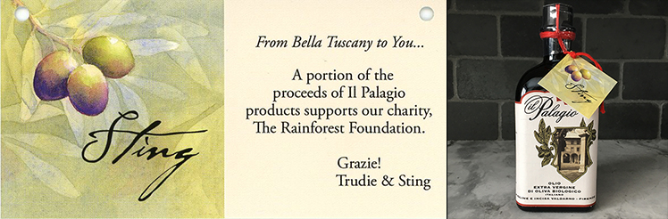
Art and olive oil…a fine combination. If you’d like to try it, contact AJO Imports.
Fast and Loose
Short on time but long on patience, I often need to quickly put pen to paper in my journal, get a first wash of color down, and then come back to finish later. The result is a journal full of sketches that took five minutes to start but five days to finish. I don’t really mind—working fast and loose has its merits. For one, my sketchbook would be empty if I waited until I had a big block of time for art. It has improved my hand-eye coordination. And it has kept in check my prior tendency to be slow, controlled, and precise.
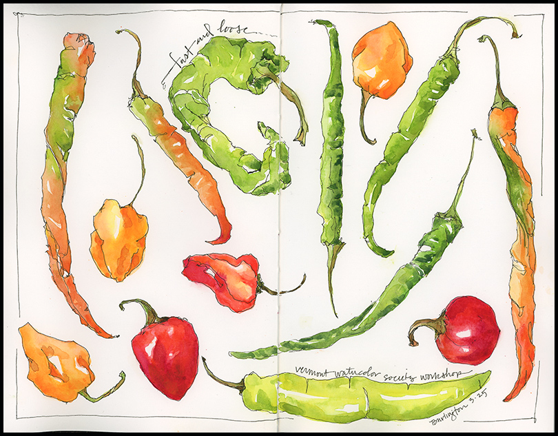
Tips & Techniques– Practice a few 30 second, 1 minute, and 3 minute contour and semi-blind contour drawings with a fairly simple subject. Fruits and vegetables are perfect. Work in pencil or pen, but don’t erase. See if you can get most of your subject down in just a few minutes. Next add a loose and light wash of watercolor. Let it dry. Then repeat; add two or three more layers of paint to deepen the colors and add depth.
One trick to this method is to suspend judgment in the early stages. My sketches often look downright sloppy at the start, but I know that the watercolor will transform them. You can always tighten up as you progress, but it’s hard to make controlled sketches seem loose after the fact.
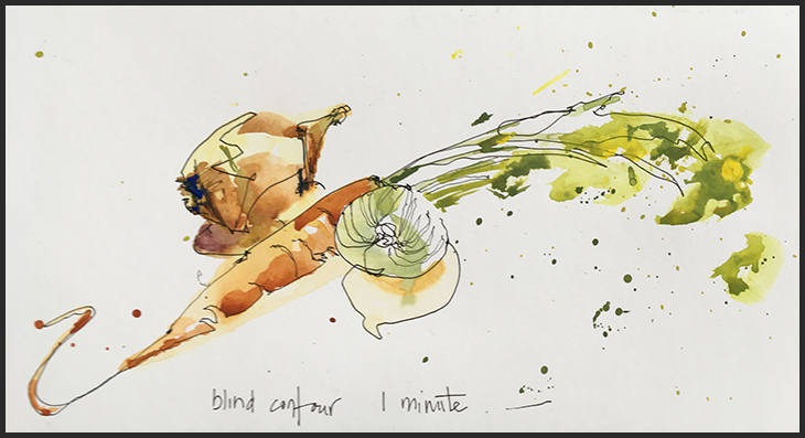 I introduced this technique with participants at a recent workshop on illustrated watercolor journaling that I offered at the Vermont Watercolor Society. Look how great this 1-minute sketch by one of the participants turned out with a just a couple of washes of watercolor.
Power Cruising in Alaska
Ever wonder what it’s like to go power cruising in southeastern Alaska—snaking your way through miles of evergreen coastline dotted with remote fishing villages? To be honest, I never have. I don’t even own a boat. So when I got an email asking whether I would illustrate an article on cruising and salmon fishing for PassageMaker magazine, I took a deep breath and enthusiastically accepted. Mind you, I didn’t get to actually go to Alaska. I just got to bring someone else’s travels to life in journal style illustrations for the article. The April issue hit the stands this week, and while I can’t show it to you in detail, I can give you a sneak preview.
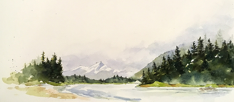
Creating the illustrations was a fun challenge that involved sifting through lots of images of salmon, boats, and Alaskan coastline, thinking about what I might have put in my sketchbook had I actually gone to Alaska, and then creating paintings that would give a flavor of the region and what the author describes in the article. The designers pulled the paintings into Photoshop and merged them to suit the text and layout. I painted the image above to run across the bottom of the title page. What you’re seeing below are layout proofs.


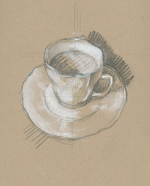
Sketcher’s Tea 2017
I recently hosted a Sketcher’s Tea—an excuse, really, for sketchers to come out of isolation in March and share a cup of tea and an afternoon of painting together. Sketching tea cups seems straightforward enough. And yet, there are lessons to be learned each time I do it. Perspective, shadows, painting whites, lost edges, reflections, patterns…the art of mastering the simple and the complex is what makes sketching tea cups both challenging and fun.
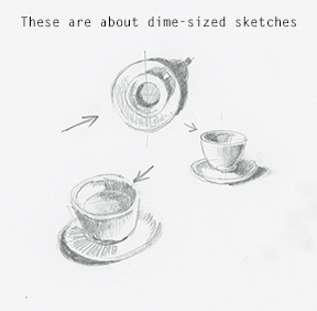
 Tips and Techniques– I often start by making a small value sketch so that I know where the lights and shadows fall. It can be hard to tell with all the patterns on the cups or if the lighting is coming from multiple sources. The paper sketch makes it easier to translate the values to the painting. You don’t need to spend a lot of time on this– couple of minutes might be fine.
#OneWeek100People: 50-100
 Obsessive, distracting, challenging, fun. Sketching 100 people in a week has been a crazy ride. Instead of eyeing the artistic properties of carrots and beets in the supermarket, I found myself wishing I could draw the man with the waist-length gray beard or the woman in the colorful scarf. I became a spy in the coffee shop and at the library: casing the joints for subjects, finding seats where I could be unobtrusive, stealing glances, occasionally getting caught.
I’ve learned a lot in a week.
- The more you do, the better you get—with a major caveat. If you keep doing the same thing over and over, you’re just doing the same thing over and over. Taking time to learn (e.g., anatomy, technique, accuracy, etc.) or trying different materials can jump you to the next level. The combination of learning and practice is how you improve.
- Sometimes working from photos is a good thing. By stopping the action and giving yourself time, you can really study your subject. You can mess around, make mistakes, and clean them up. Your sketches might be less lively, but when you go back to working from life, you just might be more prepared.
- There’s no substitute for working from life.
- Studying the work of other artists—whether Masters in a museum or fellow sketchers online—opens up new doors of possibility.
- You are in the driver seat. Sketch what you love, but push the boundaries and take risks every now and then to see what you are capable of.
Click on any sketch to view larger and see notes. (See 1-50 here)


#OneWeek100People2017: 1-50
Sometimes it takes a big push to try something new. That’s what I’m getting this week by participating in the worldwide drawing event One Week 100 People 2017*, started by Urban Sketchers Marc Taro Holmes and Liz Steel. I barely see 100 people in a week, let alone draw them, so sketching 100 people is taking me to new places, spurring me to experiment with new materials and techniques, and forcing me to study faces and figures after many, many years of not drawing a soul.
I’m just past halfway to the finish line and here you can see the good, the bad, and the way off the mark. But it’s all good and fun, really, and I’m learning a lot. I’ll share the second half and some lessons learned when I reach 100. (Click on any sketch to view larger and see notes.)


