
Making the Leap
I’ve been watching this robin’s nest on the window ledge of our new house for the last 10 days and every day I’ve wanted to sketch it. I’ve seen the tiny hatchlings go from half naked and barely opening their eyes to spouting feathers to jockeying each other for position in an overcrowded nest. Still, day after day, more pressing chores related to moving here kept me from picking up a pencil. Then this morning, I decided to get off a quick sketch before going to work, lest I miss the chance. I spent about 15 minutes on this, during which time the bird on the right stood up, stretched its wings, and made a flying leap! What a sight! And what a perfect subject for the start of a new journal and the beginning of a new chapter of my life in a new (very old) house in New York State. 
Note: I did have a chance to paint newly hatched birds in this same nest in early June. Robins often raise two broods a year and the birds in today’s sketch are from the second brood. Robins incubate their eggs for 12-14 days and the young take about two weeks to fledge. Both males and females care for the young, feeding them worms, moths, and an assortment of other insects.
Hour by Hour
How do you capture a day? In hours? In moments? The premise of the Hour by Hour sketch challenge is to put pen to paper every hour of a single day on one journal page, with no sketch taking more than five minutes. I introduced this challenge during a week of teaching at the Hog Island Audubon Camp, where the days are busy and intense. The challenge forces you to work fast and loose, while helping you capture small things that together convey a sense of the day. It’s a good challenge to try when traveling or when you are too busy to take time for a longer sketch. But it’s also a worthwhile exercise if you want to practice being less fussy with your sketching.
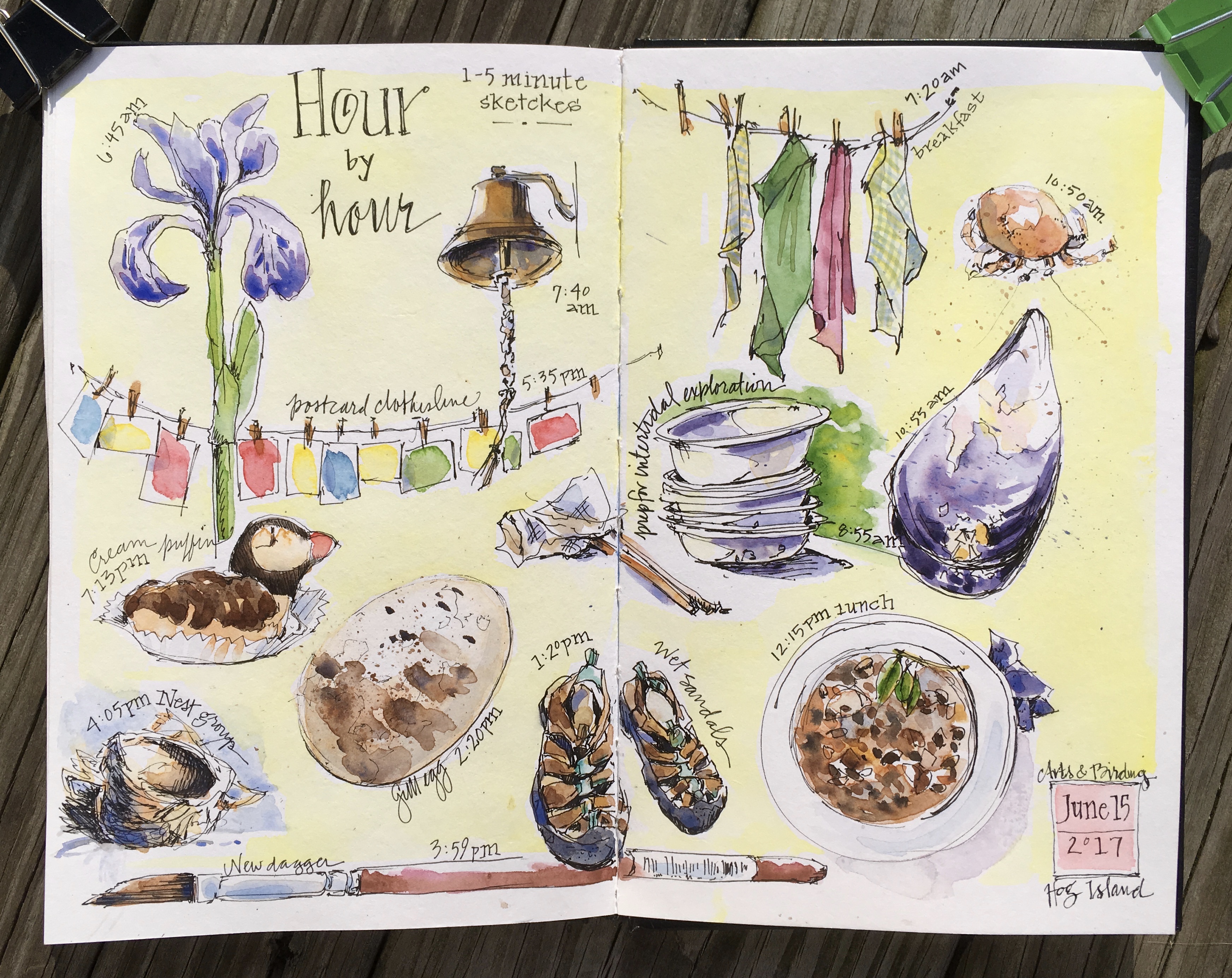
I did these 1-5 minute sketches with a Micron 02 pen and added watercolor later to finish the page.
Garlic Scapes
I planted garlic for the first time last fall and it took me a while this spring to figure out where I had interspersed it among other bulbs and perennials. Then this! ….this fabulous showing of curling greenery in the garden! And although I am moving next week and will never see the harvest, at least I have this journal page – and the promise of next year in another garden. 
Three for the Life List
On my recent boat excursion to Eastern Egg Rock in Maine, both luck and good timing were on my side. There, on this small, rocky island where puffins and terns nest, several razorbills sat on shore in full view. I have always wanted to see these sleek black and white puffin relatives, but because they breed on rocky cliffs in northeastern Canada, they are mostly spotted in winter or when migrating. The razorbill sighting alone would have made for a great day on the water, when we spied a common murre—another bird in the auk family that I had never seen—swimming nearby. Moments later, a fantastic northern gannet careened overhead, circled twice, and flew off out of view. The triple header made watching puffins seem almost ordinary. And, as you can see from my sketch, the poor black guillemot, the most common auk species in Maine, didn’t even make the page.
Puffins!
Downeast Maine is known its rocky coast line, cold waters, abundant lobsters, and maritime heritage. Enter any tourist shop and you’ll also see key chains, mugs, and bags decorated with the colorful Atlantic puffin, which breeds on a handful of offshore islands. The fact that puffins are so well associated with the Maine coast is thanks to the dreams and persistence of ornithologist Dr. Steven Kress. With backing from the National Audubon Society and help from a cadre of student interns, Kress has been restoring puffins to the Maine coast since the 1980s. Absent for more than a century due to extensive hunting and predation, puffins are once again breeding in Maine. (Visit Project Puffin to learn more.)

Click to view larger
The Hog Island Audubon Camp is home base for Project Puffin. During Arts and Birding, the week long workshop that I direct at Hog Island, we take participants to see the puffin nesting colony on Eastern Egg Rock, a small island at the outer edge of Muscongus Bay. From the boat, we photograph, sketch, and delight in watching these “clowns of the sea,” along with a host of other seabirds. Though I made some quick sketches from the boat (a first—thanks to extremely calm seas), I did this page back on land. Three cheers for puffins, seabird restoration, and a week in Maine!
Tips & Techniques– Throw out the black paint in your watercolor set. Instead, try combinations of blue and brown to mix a more interesting dark. Ultramarine blue and burnt sienna, or indigo (which contains some black pigment) and burnt umber produce rich results.
New Beginnings
This is one of those journal pages that pretty much tells the whole story. I’ve been on a crazy ride in the last few weeks with lots of travels, selling a house, buying a house, and tons of work. But as these pages convey, I’m thrilled to have this new beginning and to be landing closer to family, friends, and work when the transition is complete. I’m also grateful to be moving to a restored historic house with a great basement, new roof, and nesting phoebes and robins. Pages of chaos expected in the weeks ahead!
Tips & Techniques– Try using your basic sketching pens for hand layering. I use a Micron 02 or 005 black pen with archival ink for both sketching and lettering, which saves me carrying around a variety of calligraphy pens and inks. Write your text and then and build up the thickness of the letters to add interest.
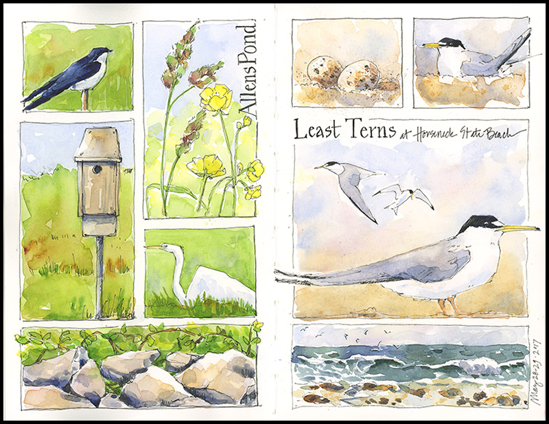
Birds and Grids
How great it is to be sketching and painting outside again! Birds nesting, feeding, soaring, chattering, resting, flying up and landing again. Flowers blooming, waves breaking, wind blowing. It’s all good. With a wealth of possibilities before me on two recent hikes, I decided a grid would be the best way to quickly capture a variety of subjects and convey the flavor of the day.
click to view larger
Tips and Techniques: Divide your page into equally-sized boxes with light pencil lines or dots in the corners of each box, but don’t limit yourself to the smallest size. Combine boxes to fit your subjects and go outside the lines if you like. I divided the pages above with eight small boxes each and decided on the right shape for each element as I went along. This technique will help your page come together no matter what combination you choose.
Almost June
Spring has gotten away from me! I’ve missed painting apple blossoms, lilacs, dogwoods, bluebells, daffodils, violets, tulips…the list goes on and on. So today, I’m happy for quince.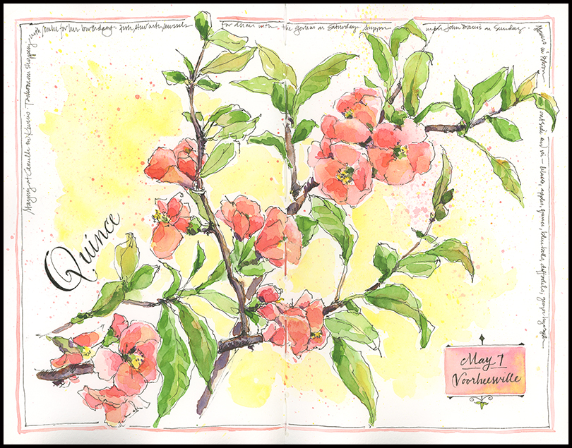
In the Clouds
Sometimes being an artist isn’t fun or enlightening or satisfying. It’s just hard work. It’s hard to figure out how to capture a scene or idea on paper; hard to get paint to do what you want, what you see, what you want to convey. Sometimes being an artist is fraught with doubt and anguish. That’s the kind of week I’ve had. I have a big painting assignment that requires big skies and working at a much larger size than I typically do. Scaling up has been a challenge—one which will no doubt prove worthwhile in the end, but which feels overwhelming in the moment. My head is full of clouds…and I’m only beginning to see a glimmer of blue sky emerging.
Do Good Things
Inspired by fragments of glass and broken ceramics pieced together on a street corner in Philadelphia, I painted this page, along with the words written next to the original mosaic. All those colors, all those tiny broken fragments taken together create something bold and beautiful and compelling— what a great metaphor for life. 


