
Ireland- Part 4: Odds and Ends

As my days in Ireland transitioned from vacation to work, my time for sketching and painting moved to finishing pages and writing notes and impressions. I added color to unfinished sketches; listed birds we saw; recorded our highlights. Yet what struck me most throughout my travels was how open and unpretentious the people I met were. From cab drivers to businesspeople to the President of Ireland himself (yes, I did get to meet him*), people were kind, friendly, and open to making a personal connection. There’s no way to capture that in a sketchbook. Still, that intangible part of traveling stays with you long after towns and countryside and grand vistas fade.
Thanks for coming along for my Ireland adventures. I’m now back to the home front, where the ordinary and extraordinary happenings of my own backyard will once again fill the pages of my sketchbook.


Tips & Techniques- Carving Stone with Watercolor
I loved the artistry of medieval stone cutters and wanted to capture some of it in my sketchbook. I found that using watercolor to carve stone is a fantastic exercise in seeing values. I highly recommend trying it if getting a good range of lights to darks is tricky for you. I used just two colors—ultramarine blue and burnt sienna for the limestone. Picking a simple palette means you won’t get lost in color and will focus only on value to create your sculpture. Here’s what to do: Choose a stone sculpture and render it in pencil. Then put a loose watercolor wash over the entire thing, letting the colors blend on the paper. Let it dry. Next paint medium values using small graded washes. Right away, your painting will start to come to life. Last, add dark areas and shadows. You might need to adjust as you go, making areas darker or putting in a bit of detail, but part of the beauty of this exercise is keeping the relative simplicity of the stone cutter’s original work. (Click to view larger.)


*My travels in Ireland preceded my attending the World Canals Conference in Athlone. President Michael D. Higgins gave the closing address and I was invited to a special reception, representing the Erie Canal and New York State.
Ireland- Part 3
I was already tired of driving when we realized that we left our laptop in our first Airbnb, a two and a half hour trip in the opposite direction from our next destination. The detour meant nearly a full day in the car, including lunch (which, at least, had a view of the sea). Fortunately, we arrived in Cashel just in time to tag onto the last tour of the day at the Rock of Cashel. The growing darkness and slashing rain made the medieval castle with its enormous cathedral ruin feel imposing and empty, but it was the haunting call of jackdaws and rooks echoing off the walls that made the experience all the more extraordinary.
The following day, I managed to sketch Hore Abbey before we set off once again—this time to the small town of Ballaghaderreen in County Roscommon, where my great grandmother was born. Through no trace remains of her house, nor the gravestones of her parents, it was moving to visit the gothic cathedral where her family attended Mass and to see the surrounding town and countryside that she and her siblings left behind forever in the late 1800s.


Tips and Techniques– Sometimes you won’t have time to sketch or paint all of the things you want to while traveling. Take a few photos, but I recommend that you not leave them for long, or you may never get back to painting them. Such was the case for me with the Hall of the Vicars Choral at the Rock of Cashel. I liked the carved angels overlooking the hall, but there was no way to capture them in the dark room and fast moving tour. I snapped a few photos, and began sketching and painting them on the airplane home. I had to give up when I spilled my water during some turbulence, but I was glad I had all the basics in place so I could finish easily at home.
Ireland, Part 2: Embrace the Weather

The weather in Ireland is notoriously changeable– sunny skies turn overcast and give way to misty rain within an hour’s time, and may just as quickly change back to clear blue, only to fill with rain again by day’s end. Unless, of course, it’s steadily raining, in which case, it will likely rain all day. This makes sketching in Ireland a bit of a challenge, but it also adds drama to already dramatic landscapes.
The sketch of Dunmore Head on the Dingle Peninsula is one of my favorites. I had seen this view in travel guides (in sun, of course), and its sheer cliffs, crashing surf, grazing sheep along the trail, and circling gannets made hiking here a grand experience. A break in the soaking fog gave me just enough time to put pen to paper.
We also had a stunningly beautiful morning in which to explore tide pools at White Strand beach just west of Cahersiveen Town on the Ring of Kerry. We saw all of these creatures (and more) but I didn’t paint them until later that day, indoors, when it was raining.


Tips and Techniques– If you are planning to sketch while traveling, jump in when something strikes you. Don’t wait for a better view or clearer skies. Don’t second guess whether the subject is worth it. Everything you put in your journal, no matter how small or seemingly mundane, adds something to the whole. I had a few moments of hesitation and regret the lost opportunities. Conversely, I’m glad I included small wildflowers and cups of tea and coffee, as these details would soon be lost if not recorded.
Ireland- Part 1

Two weeks ago, I flew to Ireland for the first time. I didn’t anticipate how profound it would feel to see the country my great grandmother left behind at age 16 for the promise of a better life in America. But as dawn broke from the airplane window and a patchwork of pastures spread out below, I saw connections stretching across miles and generations. The Irish lace that threaded through my childhood began here. It carried through my grandmother and great aunts; it spun stories, laid down values, forged friendships, and connected a large extended family.
Though I was traveling to Ireland for a conference and a week’s vacation, it felt like going home to a place I’d never been. My husband, son, and I spent our days exploring beaches and ruins, cities and towns, parks and cemeteries. It was an incredible journey. What follows is a first installment of sketches; I’ll post more in the coming days. Hope you enjoy the trip!


Tips and Techniques- The first rule of travel sketching is that there are no rules. Other than being committed to recording parts of your journey, you’re going to need to allow yourself maximum flexibility and a lot of room for sloppy, fast, imperfect sketches. I often drew on location and painted later. There was simply so much going on, so much to see, and so much time moving from place to place that there was rarely enough time for the kind of detailed and careful work that I prefer. I used both a graphic calligraphy pen and a size 03 Micron (both larger than I typically use) to try to restrict my tendency to fuss.
Preparing for Ireland
How to prepare for a trip to Ireland? Read guidebooks, re-read my family’s history, purchase a bird field guide and a travel adapter, prepare my conference presentation, pull out warmer clothes, and try to learn simple Celtic knots, fonts, and manuscript flourishes to add to my travel journal. That last bit has been the most fun, of course, but you really do need the patience of a monk to achieve the precision that makes Celtic art forms so beautiful. Here’s the beginning; I’ll fill in the white space during my travels. Watch for more in a few weeks.
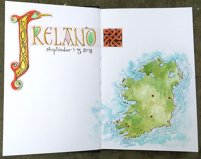
Tips and Techniques– A book I really like for learning calligraphy is The Art of Calligraphy, a practical guide to the skills and techniques by David Harris. The title doesn’t quite do the book justice. So much more than a practical manual, it also includes great information on the development of Western script and includes beautiful examples from some of the finest historical texts. The script above is adapted from Insular display capitals and illumination in the Book of Kells, which dates to the 9th century (and which I hope to see in Dublin) and the Lindisfarne Gospels, which date to 698 (located in London).
Summer’s End
It always sneaks up too fast. Dark creeps in earlier each evening; the woods go silent; swallows gather on the power lines, then vanish. I was happy to fit in a final weekend at the ocean, where it was still plenty warm for one last swim. A row of kites fluttered overhead. Yellow primroses bloomed at the edge of the dunes. But flocks of sandpipers chasing the waves amidst late-season beach-goers were a sure tell of the season’s turning, as were the multitude of bright orange-red rose hips ripening in the sun. Summer’s end is here.
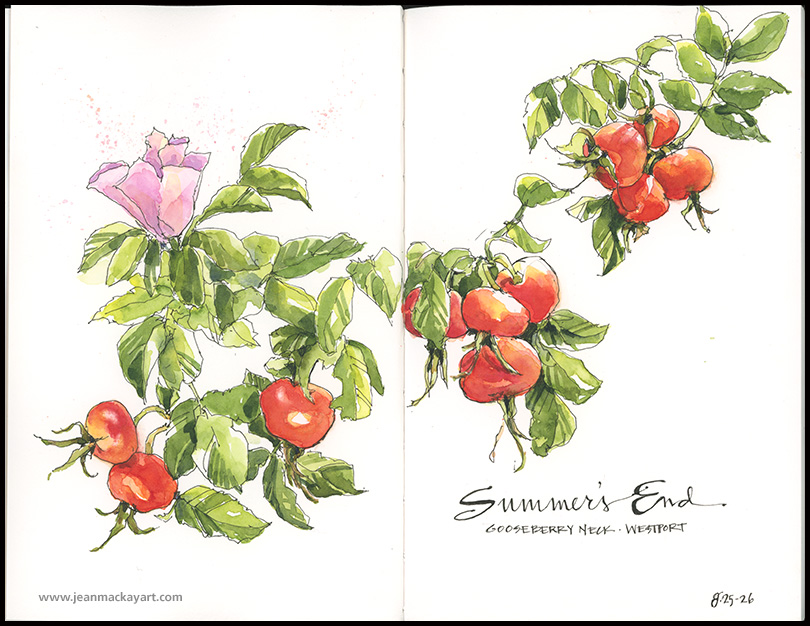
Tips and Techniques: When heading out to sketch, it’s helpful to think about what you can accomplish in the time you have. If you have 10 minutes, pick a 10-minute subject. This helps keep frustration in check, and you’ll avoid starting something you can’t finish or can’t capture sufficiently in the time you have. I’m fairly quick with drawing, but quite slow as a painter. I often choose subjects I can begin in the field and finish at later home, as was the case with the rose hips. Subjects like birds and trees take me longer to render well, so I don’t tackle them unless I have at least an hour. The more you work in the field the better you’ll become at picking subjects you can tackle well within the time you have.
Mushroom Explosion
Call me obsessed. I probably deserve it. I have spent nearly every evening this week painting nothing but mushrooms, buying field guides, making spore prints, and staying up late trying to identify my finds. In my defense, a treasure trove is growing before me– new species emerging each day under the grove of oaks that line our driveway. And I know that the intense humidity and rain that brings them out, all too quickly turns them to mush. In the end, my obsession stems from being astonished: I have recorded an impressive 26 different species in a single week: classic gilled mushrooms, large and colorful boletes, tiny coral fungi, and ringed polypores.


Consider this: several thousand species of mushrooms are found in the Northeast and upwards of 30,000 in North America. That’s more than all of the mammals, birds, reptiles, amphibians, fish, and plants combined. I found identifying them challenging, even maddening, but I learned to look more keenly at key features in the process. It’s likely that I misidentified some and I didn’t gather enough information to even begin to identify others. If you spot one you know from this collection, drop me a note so I can look it up.
Peach Season
It’s hard to exaggerate the extravagance of ripe peaches. Soft, striking, sweet, juicy…what fruits can rival them? Tomatoes, apples, eggplant, peppers? No match. Pears and cherries? Closer, but still second. Painting them is a pleasure, too. As is eating them, when the painting is done.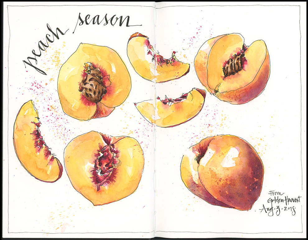
Tips and Techniques: First, I made it clear to my family, “Don’t eat the peaches until I paint them.” The previous three farmstand purchases disappeared before I had a chance at them. I started this as a simple ink sketch, and then painted multiple layers of Hansa yellow medium with quin rose, mixed with ultramarine blue for the darker skin. It’s important to let each layer dry thoroughly before adding the next. Building up layers allows the lighter tones to shine through, creating a more luminous effect than if you tried to get the color “right” in one go. I finished the page with a few details, spatter, and text (click the image to view larger).
The large and small of it
Big skies, sweeping vistas, far horizons. So much to see, too much to record. As an artist accustomed to rendering the details of small things—birds, butterflies, plants and such—I struggle when it comes to simplifying and capturing large landscapes or streetscapes in watercolor. So, I’m experimenting. My idea is to try working small on the premise that it will not allow me the space to get lost in detail. My goal is to get good in advance of an upcoming trip to Ireland, where I’ll have fantastic scenery and limited painting time. Here are my initial attempts, a few from the salt marshes of Westport, Massachusetts and two from Harbor Island and Franklin Light, Maine. (Click to view larger.)
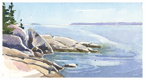


Granite Cliffs, Harbor Island: 4″ x 2.5″, Franklin Light: 5″ x 2″, Egret: 4″ x 2.5″; Salt Marsh and Osprey Nest: 2.5″ x 1.25
Tips & Techniques– You tell me! What works for you in translating complex landscapes to paper? How do you decide what’s important and what to leave out? How do you scale from small to large without getting too fussy?
Woven
I was invited to spend a recent Saturday basket making with a group of women from my old home town. What a treat! Good company, summery refreshments, and a lovely day outdoors dedicated to creative pursuits. Basket making takes patience, I discovered, both in the weaving and in waiting for reeds to soak until they are pliable enough to work. I was glad I brought my sketchbook to fill the soaking time. I came away with a finished basket and a sketch in progress, which I completed at home.
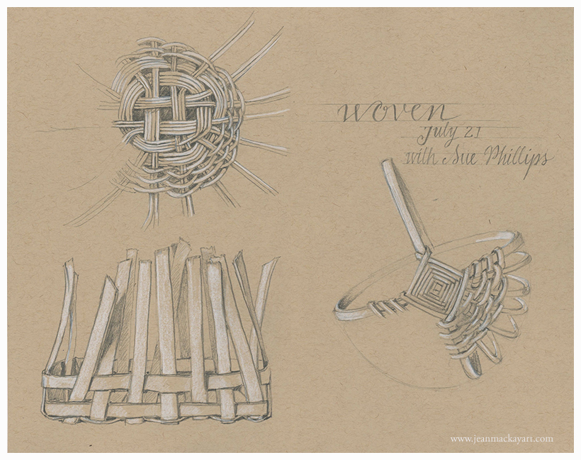
Tips and Techniques: Toned tan paper proved perfect for this detailed sketch of a monochromatic subject. I used two pencils: F and 2B and a white Caran d’Ache non-water soluble pencil on Strathmore, 400 series, 80lb. paper. The precision of the weave led me to precision in the drawing and the text, but I didn’t feel it necessary to complete each basket. I like seeing the ribs and the work in progress. No need to make the entire basket twice.


