The Trials of Painting Outdoors
Leave behind the comfort of your home art space—whether kitchen table, corner desk, or complete studio— and you’ll soon find an immediacy and sense of discovery that come from working directly from nature. Granted, you’ll be trading comfortable seating, fixed light, and a full suite of art supplies for less certain conditions. But you’ll be able to observe details, see colors, and experience your subjects firsthand in ways that will make your artwork more vibrant and alive.

At least, that’s the ideal. This week, however, painting outdoors brought significant trials: bright sun dried my paint too fast in the garden and the most annoying and insidious bugs attacked me one evening while painting irises. Was it worth it? Of course. But I’ll forever look at these irises and see myself swatting bugs in vain with a paint brush.

Tips and Techniques- Try different approaches to painting. Here, I’ve used my go-to ink sketch followed by watercolor for In the Garden and then painted directly with watercolor with no initial sketch for the irises. The bugs forced me to work quickly and let the paint run freely, which led to some nice mixing on the paper. You can see that my session with the irises was cut short. This could use a bit more definition, but I wanted leave it alone and perhaps start over, without the bugs.
In the Woods
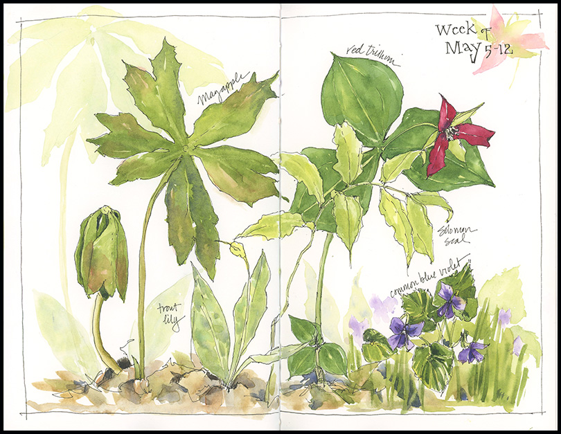
I headed into the woods last weekend to find mayapples in bloom. The flowers are hidden underneath large leaves, so sketching them required squatting at ground level. Within a few minutes, my knees sent me packing, which is, in part, why I only filled half the page with mayapples. I also wanted the white space as a place to rest the eyes and contemplate this thought on painting:
In painting, as in any art, persistent practice is not working on the object or the image or the performance alone, but rather, working on yourself, which is the constant behind all the “product” of your art. (From Learning to Look Carefully; the Art of John Morra by Ned Depew.)

Tips and Techniques– I painted this using negative painting techniques, and in trying to get deep darks to bring out the white flowers, I lost much of the light and transparency that I like to have in a painting. I would have preferred to convey a more dappled light, like that in the woods where mayapples grow. One way to avoid this is to select just a few colors — 3 or 4 — to work with for the entire painting. I started with just three, but they were too light to give me deep darks when mixed at full strength. So, I experimented with adding some dark staining colors, which gave me good darks, but began to muddy the page when added on top of the previous washes. In the process, however, I discovered why many artists have Phthalo Green (PG7) on their palette. It’s garish on its own, but when mixed with Transparent Pyrrole Orange (PO71) (and other reds) it produces a range of very nice dark greens. I plan to add these to my palette and continue seeing how they perform.
The Inside Scoop
Monitoring birdhouses gives you a rare glimpse into the often hidden world of nesting birds. It allows an up-close look at nest materials, delicate eggs, and birds at work. I have just two boxes on my property; bluebirds occupy one and tree swallows have taken up the other. In the week ahead, the bluebird eggs will hatch and, hopefully, the swallows will begin laying eggs; and I will have a chance to watch it all unfold.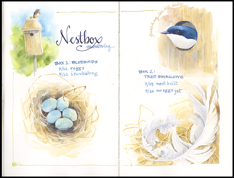
Tips and Techniques– I experimented this week with using watercolor loaded into a dip pen to write the text. Watercolor doesn’t perform as well as ink, but it certainly works, and it opens up a whole host of color options. If you want to try it, use a brush to create a pool of the color you want and then brush the watercolor onto the nib. You’ll have to reload frequently. Try starting with one color and then altering it with another to create color variation in the letters.
Find information on Nest Box Monitoring at NestWatch.
Fast and Fleeting
The glory days of springtime come fast and fleeting. Miss the trillium, and you have to wait a whole year to see it again. Migrating birds come, feed, and leave again while we sleep or work or are otherwise distracted. There never seems to be enough time in my spring; no way to capture it all before the symphony of greens gives way to summer. Still, I’ve managed some quick sketches in the woods and I was fortunate to be home when a pair of rose-breasted grosbeaks showed up at the feeder.

Green Giant
It’s good to see this old sugar maple in our front yard wearing a mantle of greenery again. Moss covered and with new leaves unfolding, it’s tangled mass of old limbs drew me in. After an hour or so, the black flies drove me away.
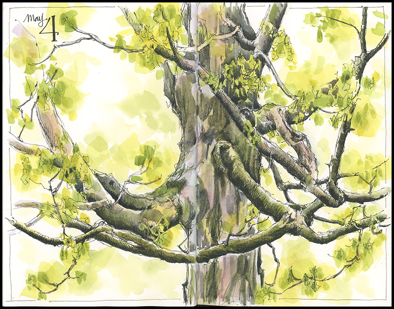
Tips and Techniques– I started this as an ink drawing and worked until it was quite detailed. I could have, and maybe should have, left it there, with just a light wash of bright green for the leaves. I had that “fork in the road” feeling—not sure whether to add more color or let it be. Sometimes I walk away at that point, coming back later with greater clarity of direction. Sometimes I leap, follow a hunch, take the risk, and hope for the best. What do you do when you reach that fork in the road with a painting?
Believer in Ferns
Come back
believer in shade
believer in silence and elegance
believer in ferns
believer in patience
believer in the rain
— W.S. Merwin (Empty Water)
How good to be out in the greening woods, despite the occasional rain and still cold spring day. Good to see ferns unfurling and mayapples reaching up out of last year’s leaves and a single ruby red trillium.
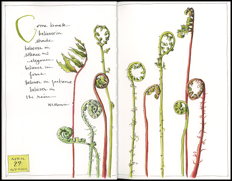
Tips and Techniques– My simple tip this week is to let observation and delight drive your sketching. Go out with no agenda and see what strikes you. I was drawn in by the variety of fiddleheads when I started looking more closely at them unfurling in the woods – some hairy, some smooth, some reddish-brown, others bright yellow-green. Had I gone out with a pre-planned idea of what I wanted to paint, I might never have seen them.
Small Signs of Spring
When art takes a backseat to the rest of my life, I find it helpful to use a grid. Setting up a framework of small squares in my journal allows me the flexibility to fill them as time allows over a period of days or weeks. I started this grid in March, knowing that a hectic schedule lay ahead. This grid started with a set of six squares per page but, as you can see, the squares can be combined vertically or horizontally to fit the subject at hand. I especially like how a grid page can capture so much of a day, week, or month in just a few small spaces.
Tips and Techniques: Set up a grid in pencil with evenly spaced squares and an even amount of white space between them. You don’t have to plan what will go in them. When you have a subject you want to sketch, choose a box and add it. If your subject is quite vertical or horizontal, combine boxes to suit the shape. You can combine as many boxes as you want, or none at all. I tend to skip around the page, based on the shapes, and outline each box at the end.
Celebrating Skunk Cabbage
Why is it that the first native wildflower to bloom each year in the Northeast gets so little fanfare or attention? Could it be its unappealing name– skunk cabbage? Or the fact you have to search for it in wetlands and bottomland forests or along damp streamsides in late-February and March? Or could it be that it doesn’t really signal the end of winter, able, as it is, to thrive when there is still snow on the ground?
Still, I think there is much to recommend skunk cabbage: it’s mottled deep maroon hood which conceals a pineapple-like flower head; it’s ability to generate its own heat; and, best of all, it’s bright green, tightly-rolled leaves that begin to unfurl in April. And now, having dug up a skunk cabbage to study it more closely, I would add to the list its massive root system, which anchors the plant deep in the ground. What more praiseworthy spring wildflower could there be?

Tips and Techniques– Follow your curiosity. Without it, I would not be out in the woods in February or studying the roots of skunk cabbage or painting many of the other subjects that intrigue me. Find what spark’s your interest and follow it.
Wishful Thinking, March
I could have titled this post: Ready for Color, or Envious of Those Experiencing the Desert Wildflower Bloom, or simply Tired of Brown. Rather than painting what’s outside this week, I decided to create my own poppy field. This piece is bigger and bolder than I typically paint. I’m still not sure what I think of it, but it has been nice to experiment with some brighter colors and assuage my wishful thinking.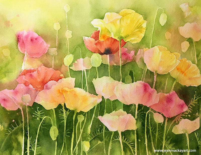
Tips and Techniques– I created this piece using negative painting techniques, starting with a wet-in-wet wash of QoR Nickel Yellow Azo, Quinacridone Magenta, and Transparent Pyrrole Orange. I let the colors merge on the wet paper and, when dry, began adding graded washes of sap green (sometimes with Ultramarine Blue), painting around the flowers and picking out stems, buds, and seed pods. There are a number of layers here, each one adding depth. I could have kept going, adding more darks, but at some point, it was best to quit, rather than risk the piece getting too fussy and overworked. (The paper is Fabriano Artistico, extra white, cold press, 300lb/640 GSM, 11×14”)
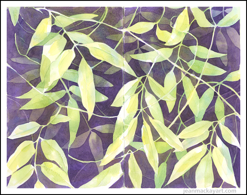
Lost in Greenery
Note to self: avoid painting at the Lyman Conservatory during the spring bulb show. Truth be told, I only glanced into the rooms that displayed a grand spectacle of colorful tulips and daffodils. They were so crowded with winter-weary visitors that sketching there was impossible. I did, however, eke out a small corner of a greenhouse where a tangle of vine wound its way from floor to ceiling. And, as crowded as it was, I wouldn’t have traded a day lost in that greenery for anything.