Not Quite Yet
Eventually, our desire for spring will match the reality outside. But not quite yet. I welcome the incremental increase in daylight and the occasional temperature over 40F, but I don’t let a warm day or two fool me. While I await spears of skunk cabbage to emerge from the snowpack, I’m also gearing up for my upcoming online class, Warblers in Watercolor. The class is intended to be a pre‑season warmup for the arrival of these delightful and elusive songbirds come May.
Like spring itself, warblers arrive on their own terms. They drop from the sky during migration and sing their hearts out, constantly flitting among the trees. Watching them feels like a game of hide and seek—they call to you and then disappear as soon as you think you know where to look. But when you do get a glimpse, you’re rewarded with a tiny colorful prize.
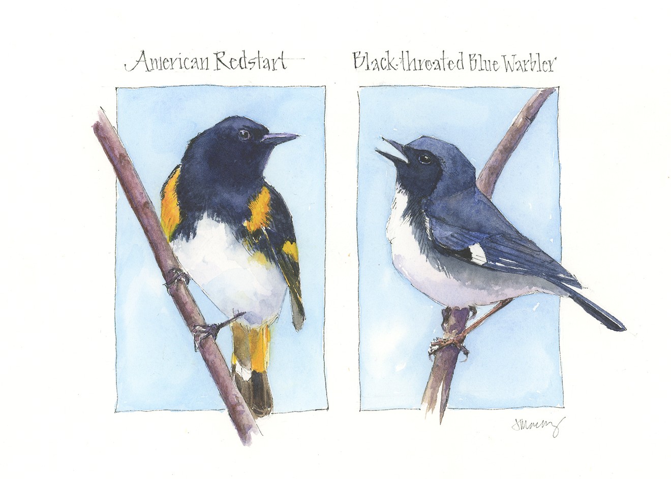
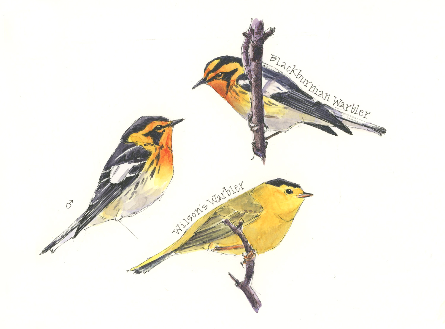
Tips and Techniques– The detailed markings on many warbler species make identifying them difficult and painting them challenging. During my class, I’ll share tips on what to look for and how to use layers of watercolor to paint them. Find out more at Winslow Art Center; the class begins on Thursday 3/12.

Beautiful !!!
Hi Helen– Nice to hear from you! Sending good wishes and warblers your way! — Jean
…but so, so close! Love the colors, sunshine and blue skies!
Much closer for you than me…but heading in the right direction!
hi jean, I love your work and I think your depiction of the Warblers is wonderful. I’m thinking of taking the class but I had one question to ask. I’m a bird watcher and I particularly enjoy looking for warblers Every Spring. I go to a place in Wisconsin that is a real warbler hotspot and we just watch warblers all day. My question is about the colors chosen in these paintings. I’m sure you know how these birds look in real life and I’m wondering why the colors are so much more subdued in the paintings? The only one who I would say has accurate colors as I see them in the wild is the black throated blue. All the other oranges seem very subdued and the yellows also seem subdued. Is that because you find it difficult to get the accurate color with watercolor? I realize I have the option to paint them any color I want but I would want to paint them as close to real life as I can. For instance the redstart almost has that sort of Rusty color that you see on a towhee and the redstarts I see are really quite bright orange. Not as bright as a Blackburnian’s throat but still much brighter than that painting. I realize this is a personal choice and that I can make mine brighter if I choose to but I’m just wondering what the reasoning is for making them so much more subdued on paper than they are in life? I still am interested in taking the course and I think I’ll sign up today. But if you have time to put an answer here I would really appreciate that. Thanks a lot again I enjoy your painting and I think it’s just absolutely gorgeous. I also like the way you show the angles of the birds form. I’ve been working on drawing a bird a day since December and I’m trying to pay close attention to those angles. Thanks exclamation Pat Wafer
Hi Pat- Thanks for your note and thoughtful observations and questions. I didn’t think of these as being subdued so one thing I wondered when I read your note was about the brightness setting of your screen. I wonder whether yours it set at less than 65%, as that would make a difference. I do try to paint birds the color that they are, though sometimes that’s impacted by lighting conditions or reference photos. I hope this helps, but feel free to write me back if you have additional questions. — Jean
Thanks for your reply, Jean. The light on my devices is not the issue but I think I figured out some things. First, I am going by my memory of what the birds look like in the field. Memories can vary greatly in accuracy as we know! Also until I started drawing birds mostly from photo references this December I have not looked at a huge amount of bird photography and when I did look at several species in your email I can see that for the most part your colors are spot on. But the other thing that affects the color as we see it are the color NEXT to each other, and of course light conditions vary a lot. And cameras while they are a great tool in studying birds because they don’t move every second or two do not always record color the same way our eye sees it. So I think all those things combine to account for the discrepancy of vibrancy of colors when I look at your sketches on white paper as opposed to my memory of what the colors looks like to me in the field. I know I don’t have any cataract issues because I asked my eye doc at my last check up last October! This May when these wonderful little birds come back through Wisconsin I will pay more attention than usual to their colors and how I perceive them. Now I am going to go sign up for your class at Winslow! Pat
Not Quite Yet is a perfect header for your warbler pages. I always say “Not Soon Enough!”
It was soon enough for our juncos tho … they headed north on a 75 degree day about 3 days ago. Sorry to see them go, but that means our spring is knocking hard at our door, even though it froze hard last night.
hope your warbler class is going grandly! Chirp!