Farmers Market Bouquets
A few weeks ago, I wrote about my Farmers Market quest, and these two bouquets are some of my more recent discoveries. I used them as subjects for the final session of my Fun Farmers Market class, which wrapped up last week. There are many ways to paint a bouquet, but because I wanted to convey a bit of fun, we worked loosely for the ink sketch and then tried to keep the watercolor flowing, especially in the early stages of painting. The white on black label added a casual farmers market element to finish the piece.

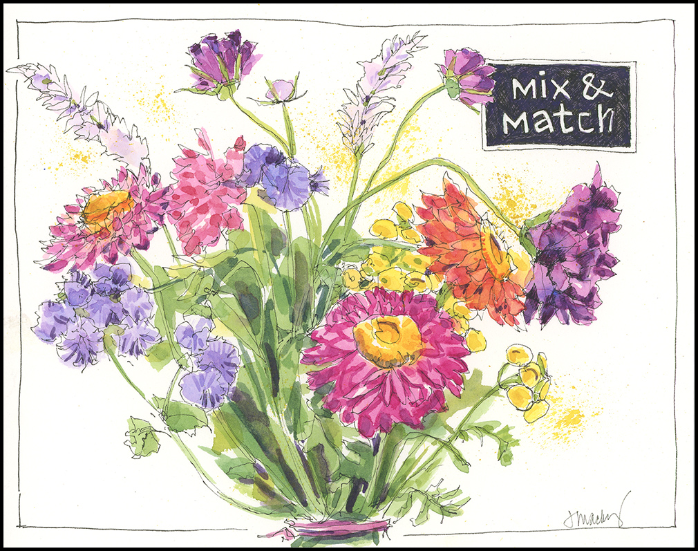
(Materials: Top: Micron 005 pen and watercolor in Handbook Co. 140lb Watercolor Journal; bottom done on New York Central Art Supply 100% cotton, 140lb HP watercolor paper)

These are lovely, especially the zinnias! I always have trouble with trying to paint their million petals, any tips?
I love the way the petals overlap! You might start with one of the simpler varieties, where there is only one overlapping layer. That may help you decipher the structure, so that you can tackle the multi-layered variety. Also notice the effect of shadows in differentiating the layered petals. It’s often darker on the petals below, which helps to create dimension. Noticing and painting the values should help!
I absolutely LOVE both of those!!! Especially like the color combos. Beautiful work, as always.
Thanks! Wish I could send you the bouquet itself!
Oh my! Beautiful, beautiful, beautifully done, Jean. At first glance, the top floral looks purposely arranged; anything but loose. Maybe it was all the parallel stems? The closeness of the individual flowers? But, for me, the looseness appeared on closer inspection of the inked lines.
The second floral appears much looser! Reminds me of flowers caught mid entropy … so full of energy. A botanical free-for-all!
What a wonderful Farmer’s Market class it must’ve been! Thanks for sharing. Have a grand day!
Yes, the inked lines are loose. The second bouquet was simply a much looser arrangement to begin with, much less compact. I’m sure other artists might go much looser still. I just didn’t want to go botanical with it and get caught up in being really precise. Happy Labor Day!
got it! Always beautiful work, Jean!
Lovely! I do enjoy using watercolor and micron pen ink and am inspired to use your beautiful bouquets for practice. Thank you Jean.
Feel free…or pick up a few mix and match stems that you like and work with them. Have fun!
Your bouquets are gorgeous, Jean! I love the compositions and color choices. I wish I could have taken this class. Just beautiful! Did you paint around the lettering on the labels or did you use white paint/marker? Wait, I see hash marks. Was the background done entirely in pen? Which paper did you like best for loose painting?
Hi Susan- I made the labels by hatching first and then adding a layer of purple watercolor. I like both of these papers. The NY Central HP paper is great to work on– smooth enough for ink but also nice for watercolor.
Thanks, Jean. The labels read like chalkboard. They are a perfect addition to farm market finds.
These are beautiful Jean, Thanks so much for your weekly shares…really brightens my day everytime! Linda
That’s so nice to hear, Linda! Thanks for saying so!
Beautiful! You inspire me! T. Terry