Sound Advice
A pop of red amidst a tangle of greens, scarlet runner beans wind their way to the top of the garden trellis, sending flowers to the sun and beans drooping toward the ground. Just a few months ago, they were a mere handful of purple and black streaked seeds. Now, they dare you to imagine that they were ever anything other than extraordinary. And so, I think that writer Robert Brault is onto something: If you’ve never experienced the joy of accomplishing more than you can imagine, plant a garden.
(Click to view larger.)
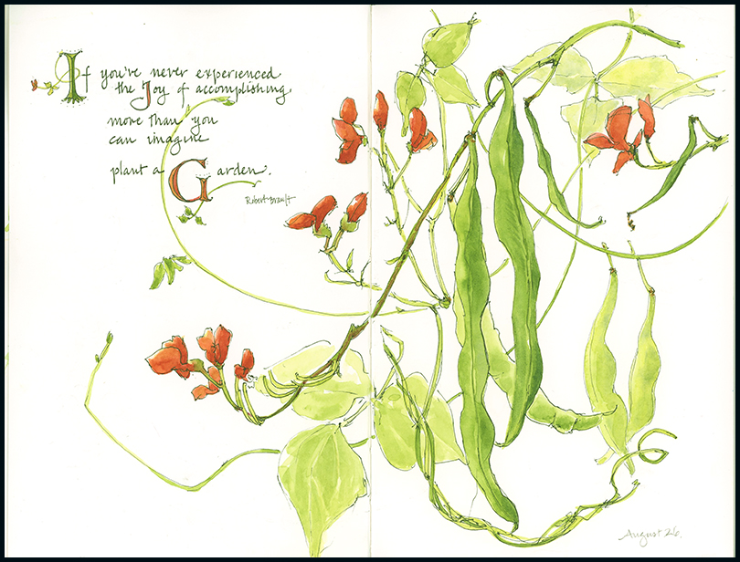
Tips and Techniques: Sometimes, the composition of a piece is sitting right in front of you, and sometimes you have do a bit of rearranging to make it work. I saw the central elements of this piece—the three main dangling beans and the diagonal vine with red flowers on the left side of the page—right on the trellis. But I needed to add flowers, leaves, beans and tendrils from several different runner beans to complete the composition. As an artist, don’t feel that you need to draw exactly (or only) what is in front of you. Give yourself creative latitude to move things around or eliminate something to create a stronger composition.

Jean, this is lovely. I love how you incorporated the “pop” of red in the lettering as well. I have a question about your lettering: you were using a colored marker or watercolor with a dip pen?
I used a Micron calligraphy marker for this. It has a 10pt chisel, which is quite small, but I thought it might be good for drawing and lettering (although I didn’t draw with it for this– I used a Micron 02 pen). The ink is waterproof and one of the only calligraphy markers I’ve found that is.
Could you please tell me what brand? I am having a hard time finding ones in color. Have you ever had an issue with a yellow ghost bleeding through the back of a sketchbook page after a few months? I used a red sharpie colored micron once for a journal page. A few months later, I had yellow ghost lettering showing though the back of the 140 lb. watercolor page. Thanks!
Annie- the one I used here is Pigma Micron Calligraphy. It came in a three pack with three different sized nibs. At first, they were very stiff, but maybe they will loosen up. I have also tried Marvy Pigmented Calligraphy markers that come with two sizes – one at each end of the pen. This brand seems to come in colors other than black. When I am doing calligraphy that I care about (i.e., not in a journal) I prefer a dip pen and ink.
Very sound advice as always !
I’m enjoying having garden subjects right out my back door this year.
I love the graceful rhythm of your beans and vines. Beautiful…where I would not have thought to be so. Thank you or encouraging us to look deeper at the wonder found in nature.
Do you also use a Micron 2 for signing your name? I’ve tried using a #1 Quiller brush but I am not happy with the results…too obvious.
Thanks Bernadette! I often sign my name with a very sharp pencil. I don’t want it to distract from the artwork.
Won’t a pencil fade? I agree that it is difficult, especially with a long name, to sign using a brush, no matter how fine. Thanks for your advice. I appreciate it.
Haven’t had one fade yet. In 100 years, maybe.
Lovely page. I’ve been looking at my beans and thought they would make a nice page. I have red ones and also some that are called Painted Lady, which are red and white. They are amazing ,especially this year as we have had a lot of rain. I always enjoy your tips and techniques.
Great Mair. I always like drawing vines, which is why I chose scarlet runner beans. Your varieties sound intriguing.
Love this composition! Thanx for the advice AND the quote. I’m a collector of good quotes. This one fits your sketch perfectly. Love this.
I used to be a quote collector and I should start again. Your comment inspires me to pull out my quote book and keep it going. I especially like seeing the quotes illustrated in my sketchbook.
How inspiring- the painting and the advice!
Thanks Denise. This one came easily, which is always nice, but rarely the case.
This is the difference between an artist and a reporter. And thank you very much for the quote.
Lovely sketches Jean and sound advice about composition…
Beautiful and inspiring work!! Your journals make me want to paint again! May I ask what size journal you use? I think you’re using a Stillman and Birn Beta, but couldn’t figure out the size. Thank you!
Hi Sharon- Yes, I use Stillman & Birn– this one is the Zeta, size 5.5×8.5″. I find this size is easy to carry with me and take in the field, and I typically work across the entire spread, giving me 8.5×11″. I rotate between the Zeta and Beta and like them both. Pick up that paint brush!
That creative latitude to move things around is something nature photographers argue about. There are purists who don’t ever touch a single twig (and take a written pledge to adhere to that) and others who will make changes so drastic, the scene is hardly recognizable. I like to photograph the ground a lot, and sometimes I do remove that one offending twig to make for a better composition. Yours dances across the page in a very light and lively way – I’m glad you had your way with the elements! 🙂
There are similar rules and debates about them in the art world. Mostly, I find myself trapped when I start thinking that I “should” or “shouldn’t” do a certain thing. Photoshop brings its own set of quandaries. Mostly, I am trying to free myself to use my own creative license as an artist.