Perching Birds
After a successful experiment with perching birds on words, I decided to develop a series of paintings pairing birds with their names. These may make good prints or cards, which I will pursue once I’ve done four to six pieces. Here’s the first two.
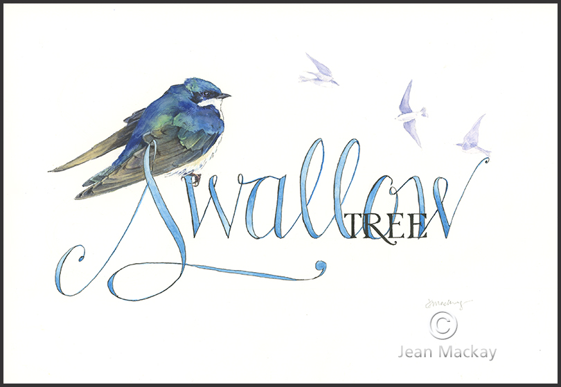
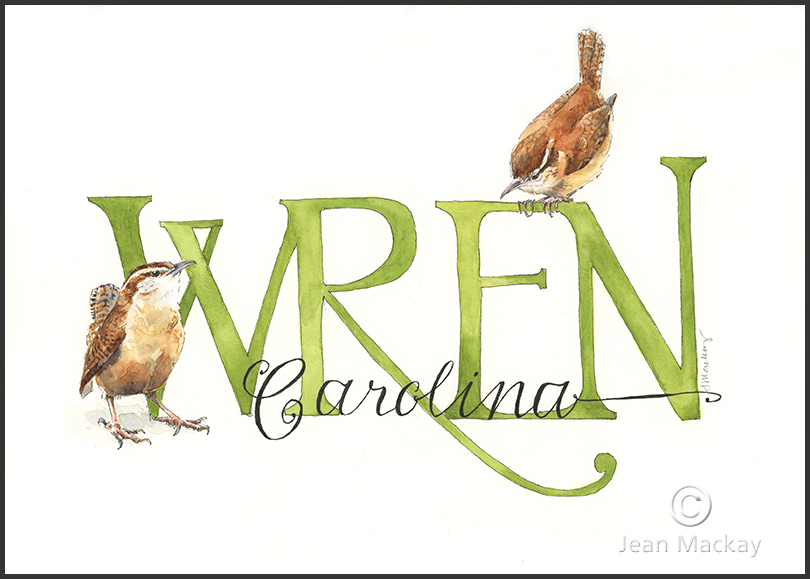
Tips and Techniques– If you are going to spend a lot of time creating a finished piece of art, spend time upfront on thumbnail sketches and color choices to work out potential issues before you begin. I mocked up different bird poses and lettering styles before starting these and it was well worth it. Though I had already painted a wren piece in my journal, I switched the posture of the bird on the E several times before settling on the down-facing pose. My first mockup of the swallow with capital letters proved that the word itself was too long. Switching to cursive, tightened the space. I also tinkered with the variations on the letter S and where the bird should perch before figuring out a placement that seemed balanced.

Love these
Can you share some of the mock ups ?
Hi Soni- I’m not sure the scribbles and erasures are worth sharing for these, but I’ll keep it in mind to share a mock up with the next one.
All that work paid off. These are just right. Both lovely and charming.
Thanks Dawn! There are many pieces that have to come together to make these work. I’m glad I didn’t wreck them along the way.
Absolutely lovely!
Thank you Denise!
Love the birds. Don’t let me miss your Robin.
My grand daughter is Robin.
Robin Lucinda to be exact.😍
Ah…lovely name. I was thinking about doing a robin, so maybe that will be next. Short word, and a nice, common bird. I also have a design in my head for a great blue heron.
If you are going to turn these into note cards for purchase, your name will need to be smaller (but still readable of course) or it detracts and distracts from the art itself. I love the idea of finding just the right font or print/script style that fits each of your subjects. Your compositions, technique, and use of color is very lovely!
Of course– the name/watermark is only for online display, since artwork is frequently pinned and shared without attribution.
Delightful, as always, Jean, and I appreciate the reminder to ‘audition’ with thumbnails.
I rarely do it in my journal, but almost always do for finished artwork.
So creative. Thanx for the thumbnail suggestions. I always forget and charge headlong. Then correct til I’m crazy frustrated. These are beautiful.
Thanks Erica. It’s easy to jump in and then try to fix problems, often to the point of overworking. You’re not alone!
These are beautiful. -a thought on words tho’:: we tend to read from left to right and front to back so; while Carolina Wren worked well Tree Swallow was initially confusing because of the reversed placement of the words. I wonder if other people stumbled or if it is just me?
Thanks — I struggled a bit where to put “tree” because I didn’t want to crowd the left side. Still, swallow is the main thing and the specific species is a bit less important. I appreciate your thought.
it’s just an observation. the overall design is beautiful and i do indeed see why you placed it as you did.
I love both of these and immediately saw what you were doing with the placement of the lettering and the species name. I think it’s brilliant…the common more familiar ‘name’ standing out. I can’t wait to see what’s next. I’m especially excited to see the heron. How about a kingfisher?
Hmmm…kingfisher. I’ll have to think about that one!
yes good points and thanks for sharing
Thanks Mireya
splendida meraviglia! bravissima!
Thank you– appreciate it!
Absolutely beautiful! They make me smile.
Thanks for sharing both the finished “bird on words” and the thought process that led to the finished design. Too often I rush into a subject….hoping it will work out. Planning is so important but for me often neglected.
I suppose there is a balance between planning and spontaneity. But working out some of the bigger structure/shapes and design ideas typically pays off. I think the mock ups can help get you in the groove for drawing/painting too. Thanks for sharing your thoughts!
They’re both beautiful. Can’t wait to see the cards.
Thanks Stacey!
So beautiful, Jean. Can’t wait for the cards!
Thanks for taking the time to share your positive feedback!
Just beautiful!
Thanks Chris!
The decision to put the type of bird front and center and the adjective smaller is brilliant, as are the whole layouts, and of course, the painting. That wren perched on the “E” is as sassy as they come, making me miss Carolina wrens so much! And the cursive “Swallow” in a slightly ethereal blue could almost take to the sky, just like a Tree swallow. This is going to be a fabulous series. 🙂
Thanks so much! I’ve begun to work out possible designs in my head, trying to decide what to do next. Hoping to put pencil to paper tonight.
These are beautiful. Thank you.
Thanks Hanna! A lot of pieces are coming together with these.
You are Mary Oliver in paint instead of words.
Well that is very generous Melissa!
Gorgeous birds and lettering, Jean. I love the colours and floofiness of the swallow and the position of the little wren looking down (oo, that tail!!!). And I liked reading about your design process too. 🙂
Thanks Myriam- I start pretty loose when painting the birds, letting loose washes do some of the work for me. Then I tighten up to get the details. I’m finding that combination works pretty well.
Gorgeous, as always. Thanks for the reminder to do value sketches and mock-ups. Important first steps.
It’s worth it if you’re going to invest a lot of time in a piece. Sometimes your first idea is not your best, but a spark of something better comes to you when you do a mock-up. Your painting is really advancing by leaps and bounds! You must be pleased by how far you’ve come in such a short time.
Beautiful and inspiring! Do you work from photos? Or do you know birds so well you can just draw them? Or do you have some other tool/resource? Also, I love your lettering styles, do you use a style sheet for these? Thanks for all your tips.
Hi– Let me try to answer your questions: I’ve observed and studied birds for many years and I’ve sketched live birds and dead birds from museum skins and specimens so that I am familiar with anatomy and feather groups. I also work from photos, but it’s the combination of all of these that help me when I sit down to paint a bird. As for lettering, I have studied and practiced many letter styles and calligraphy over the years. The fonts here are my own variations on basic italic script and Roman capitals. Pick up a copy of the Speedball Textbook– its a great basic resource. Best wishes!
Jean, Wonderful pieces. As a photographer, I was especially interested in the question above, “Do you work from photos?”– and your answer above, which certainly explains why you have the “feel for the organism” that is so evident in your work.
Thanks Dave. It’s pretty easy to “kill a bird” when painting it. Getting the right combination of specifics and suggestion, loose and tight are important. There’s no substitute for observation, which is why I don’t paint birds (or other animals) I haven’t seen in the field.
No substitution for observation, indeed. Couldn’t agree more. Keep up the good work.
Nice to see your bird photography on your blog Dave. Here’s to getting into the field!
Jean, Small world. Am a huge Mary Oliver fan who quickly teared up when I learned of her passing. Then I went and read and reread “Goldfinches” from her “New and Selected Poems.” I may provide a link to your tribute in an upcoming blog.
Jean, Have others reblogged your posts? Am considering reblogging your Mary Oliver post and adding to it.
Hi Dave- Thanks for asking, and Yes, others have reposted and included a link. That’s fine. I’ve been rereading Mary Oliver poems lately– there’s so much clarity in her words.
Jean, If I reblog, would all the comments be reblogged as well?
Jean, I wonder if you ever read the ‘reblog’ and my comment. I’ve had many visitors, and some have visited your site as well. Dave
Hi Dave- Thanks for the reminder. I visited your site– glad you had many visitors and interest in the post!
Delightful. What a lovely idea 🌺
Thanks. I’ve sketched some thumbnails of my next two in the series and now need to get going on committing them to watercolor.
Look forward to seeing the next.
What a cool idea and wonderfully executed!
Thanks Karen!
Jean, These are amazing. I love the wren!!
Thanks Mary!
I love them and so many wonderful birds to choose from.
I’m ready to start another one after a particularly busy week.
Pingback: American Robin | Drawn In
LOVE!
Hi Bird Brain Sisters- Thanks for stopping by. I LOVE your bird art on your blog. It’s so fun, so zany. I didn’t see a way to sign up for your posts, though. What’s the secret?