Hand Lettering
 In addition to Wishing you joy this holiday season, I thought I’d do a longer post to answer some frequently-asked questions to this blog on how to improve hand lettering to enhance journals and artwork.
By way of beginning, I should say that I love adding text to my artwork and I’ve been at it a long time. My fascination with letter styles started when I was a kid, making birthday and holiday cards. By about fourth grade, I began to try out different lettering styles and by high school, I started teaching myself calligraphy scripts. Over the years, I’ve practiced illuminated letters, the Palmer Method, and various letter forms. But since you may not want to study the history of alphabets or practice for years, let’s cut to the chase. Here are a couple of ways you can improve the text in your artwork without a lot of study.
My first piece of advice: skip bubble letters! They are meant to be used by children only.

Enhance your own handwriting or printing.
One of the easiest ways to begin is to vary the stroke weight of your own handwriting or printing using a regular pen or pencil. Try this:
- Print a word.
- Go back over the letters and thicken all the vertical lines.
- Fill in the spaces between the lines.
You can leave the letters just like that, or add a “serif.” A serif is a small line at the top or bottom of a letter. Letters without those lines are called “sans serif” (“sans” in French means “without”).
Try a little variation on curved letters. First thicken the downstrokes at 90-degrees. Then try thickening the curves at a slight angle. You can vary the stroke weight on printed or cursive letters. Practice making the letters taller or thicker, or add a little flair.

Use a ruler or straight edge
If you want your letters to look neat on the page, use a straight edge to mark the top and bottom of your letters. If it’s your journal and you don’t want to fuss, skip it.
Add color
You can write your text in any color you want, or outline it in black and then fill the space with color. Colored pencils will give you a lot of control. Watercolor works well too. I use small brushes with fine points when filling letters. You can use two or more colors for variety, floating in the colors so they merge. With practice you can skip the pen and just use watercolor. I layout in pencil first if I’m going to do this so that I have guide marks on the page.
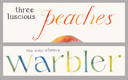
Two examples: combination of basic enhanced printing in black ink with fancier letters done with two- and three-color watercolor lettering.
Calligraphy pens have specially designed nibs that create the thick and thin letters. You can get calligraphy markers or use traditional dip pens with ink. Either way, they take some practice. I prefer pens with ink as the lines are finer and inks more beautiful than markers…but I’ll leave that for another post.
Practice!
Take some time to play and practice. Look at letters on cards, posters, and advertisements with a critical eye, try out some different styles, and have fun!

Practice page and finished product.
 A few favorite reference books:
- Speedball Textbook– widely available and has lots of different calligraphy styles, instructions, and samples. A great place to start.
- The Art of Calligraphy by David Harris- goes through the history of various letter forms, but also includes alphabets, techniques, and samples from historic texts.
- Illuminated Alphabets by Patricia Carter- techniques, design ideas, and sample alphabets
- The Bible of Illuminated Letters by Margaret Moran- This small book packs it in! Classic techniques for gilded letters, historic alphabets and information.

You must have been looking over my shoulder today. I was practicing lettering! So glad for your little blog! Good ideas. My next stop is Staples to pick up some appropriate lettering tools to practice with! Thanks. BTW Merry Christmas and Happy New Year to you and your family and friends. Looking forward to Hog Island Workshop in July!
Thanks Carole– Hope you have fun with your new supplies! Enjoy the holidays!
You and Pam Johnson Brickell use calligraphy to make your pages beautiful….your styles are different. Both onderful! Thank you. Great explanation.
Thanks Cinda- I agree– Pam does a great job with her lettering. I think everyone develops their own style, adapting and testing and finding things that work. Enjoy the holidays!
I was introduced to your blog this fall and find your work very inspiring. I particularly enjoy your hand lettering as well as what you choose to say, from the factual to the whimsical! Today’s posting is a lovely gift — thank-you. Wishing you happy holidays and all the very best in 2016!
Thanks for your comment…glad you are enjoying the blog and finding it inspiring!
Thank you, Jean, for your interesting and timely advice! I also want to add that the first image is a standout stunner. Love the bell, the lettering, colors, layout, really shines. Merry Christmas to you and yours!
Thanks Laura! Here’s to lots of time to create in the New Year!
This was very helpful. Looking forward to another workshop with you.
Great Catherine– thanks!
Thank you so much for the advice! 🙂 Do you have some tips in “slanting” the letters/words? Alsooo! Tips on adding flourishes? Can’t wait to see your other posts. ❤
You might try making a faint pencil line at the angle of slant you want and then practice getting letters on that angle. Practice with letters like lower case l, t, b, d, h– letters with tall ascenders will help you see whether you are consistently on the angle of the slant. For flourishes– Take a look at calligraphy scripts for samples and keep your flourishes mainly to the first letter to avoid overdoing it and making the word hard to read. Best wishes!
Thank you so much for the tips!! 🙂 I can’t wait to try them out.❤❤ Happy Holidays btw! 🙂
Thanks so much for this lesson, Jeanne! Your samples are inspiring and your instructions of just how to start very helpful. I look forward to practicing in the new year.
Happy Holidays from the soggy Pacific Northwest!
thanks Linda– glad this was helpful!
practice and having a plan –two things i need to work on 🙂 Thanks for this post! wishing you a wonderful 2016!
Thanks much! Yes to making a plan, which is something I’m thinking a lot about for 2016. What’s next? What do I want to do, see, paint? How can I learn and grow as an artist? Trying to define goals and make a road map. Thanks for following the journey!
Great post – it makes me want to give it a try, although I’m not very artistic 😦 – thank you !
What have you got to lose, Joan? Give it a go!