
Nest Map
Finding bird nests is something typically reserved for late autumn, when fallen leaves reveal summer’s hidden treasures. But I’ve been lucky this spring. Bluebirds and trees swallows took up residence in nest boxes we put up in April; a robin returned to a nest used last year on an upstairs window ledge; I spied a pair of cardinals making their nest in a hemlock bough; and, just last week, I caught sight of an American redstart as it landed and disappeared into a tangle of shrubbery at the edge of the woods– a tell that led me to discover its well concealed nest. I know there is a lot more nesting going on in the surrounding woods and field, but it may be autumn before I am able to add more to the map.
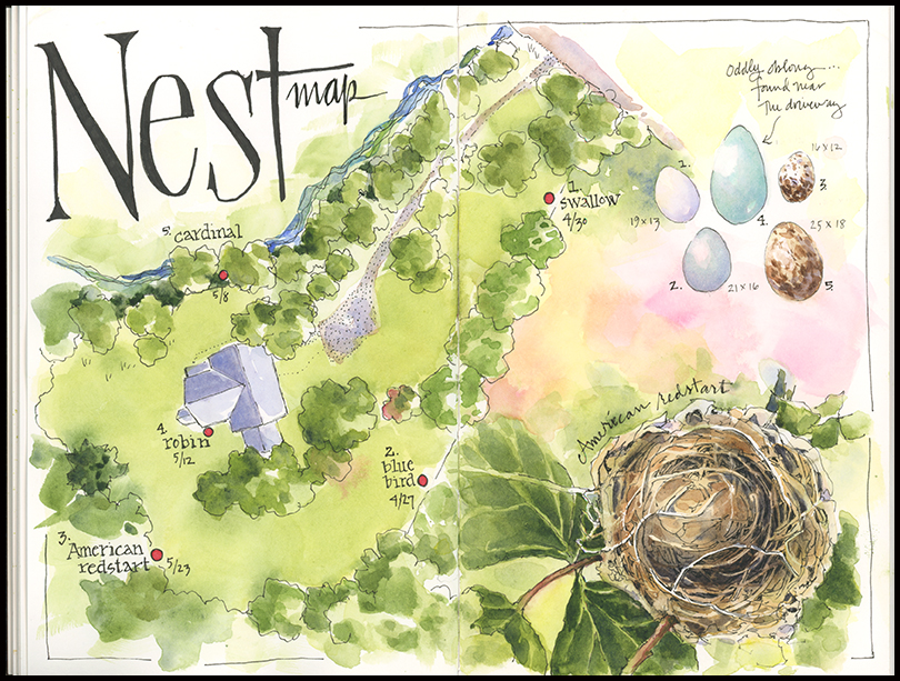
click to view larger
Tips and Techniques– I love making maps and find that it is an excellent way to learn and record information. I made this one so I would have a reference for future years’ nesting activity on our property. I used Google Maps to sketch the aerial view– it’s a great tool for getting the basics of the landscape geography you want to record. Once I had the map laid out, I added the nest, using a photo of the actual nest so as not to disturb the birds. I had been hoping an egg or two would have already been laid, but because I was a bit too early, I decided to add the eggs for each bird as a separate element. I used the Princeton Field Guide Nest, Eggs, and Nestlings of North American Birds by Paul Baicich and Colin Harrison as a reference, as well as an atypically oblong robin’s egg found abandoned near our driveway.
Among Dogwoods
Standing among sunlit dogwood blossoms is a treat: white petals bright against a backdrop of dappled greens, blue sky, and bird song. The moment would be perfect but for the gnats that bite the back of my neck while sketching. They force me to draw fast and loose and then retreat to the house. Still, when I look at this painting months or years from now, it will not be the insects I remember, but the long-awaited spring day and the blank sheet of paper bright with promise.
Among Dogwoods, 5×7″, watercolor on Fabriano 300lb cold press watercolor paper.
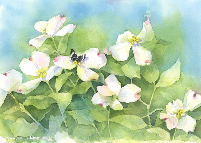
Tips and Techniques– I took advantage of negative painting techniques for this, starting with a wet in wet wash of phthalo blue, Hansa yellow medium, and quin rose over my pencil drawing. I left a lot of white for the flowers, but you can see that I wasn’t exact with every edge. Once dry, I proceeded to do a long series of varied washes to define to foliage and create a sense of depth. I find that this type of painting takes a while to develop, and doesn’t fully take shape until I add the darkest layers and final details (e.g., the moth, shadows, and red highlights on the flowers). I worked on it over the course of a week. Stepping away is not only important for letting the paint dry between layers, but helps me come back and see it fresh.

Here’s a second painting that I started that will give you a sense of what this looks like in the early stages. You can see where I’m just beginning to pick out the shapes from the pencil drawing. Patience is key!
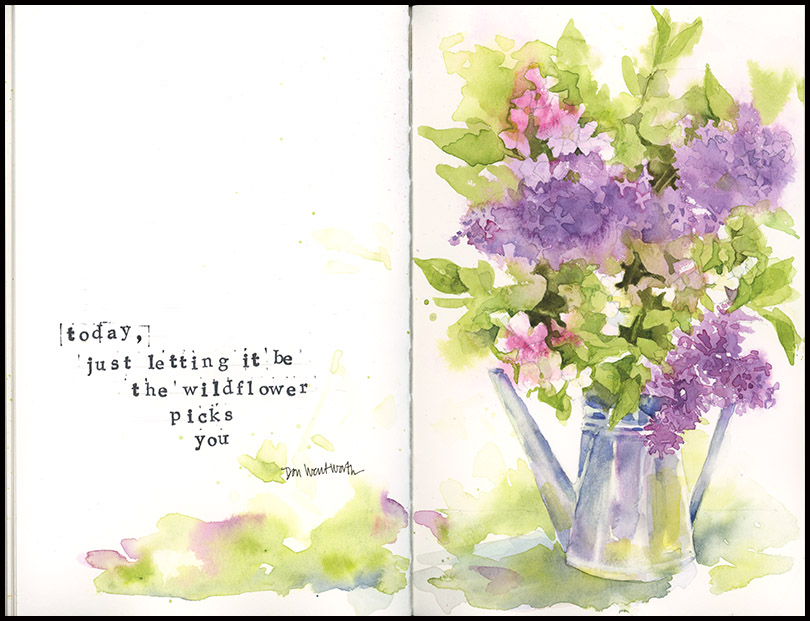
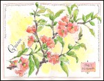
Lilacs
Isn’t it nice to think that Don Wentworth’s poem may be true?
click to view larger
Today, just letting it be
the wildflower
picks
you
Have a great weekend.
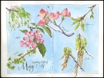
At Last
Each year we wait. We count the days, watch the weather, complain, wait longer. Our patience stretched thin by the cold and by gray skies that are slow to yield to clear blue. Then suddenly, at last, we are surrounded by green. I can never keep up; never find time enough sketch or paint it all. Still, this year as in the past, it is a pleasure to try.
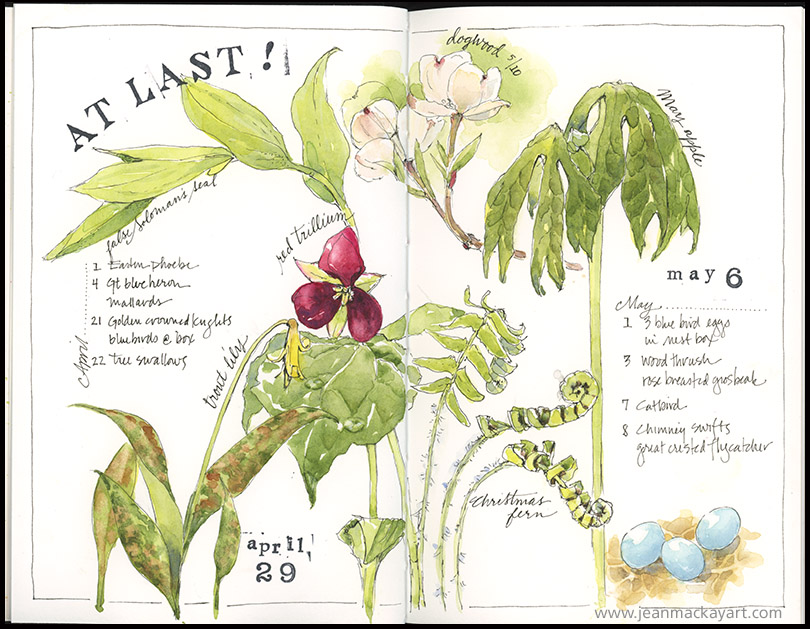
Tips & Techniques– The window for capturing spring ephemeral wildflowers is very short– miss it and you have to wait a year. This page records some of what I saw during hikes on April 29 and May 6. The second walk was challenging because it was raining. Determined, I discovered that I could hold an umbrella and sketchbook in one hand and my pen in the other. It’s a new technique for me — not bad, but I’m not quite sure I’d recommend it.
Spring Gallery- It’s fun to look back at prior years and compare sketches and dates.
-
- 2017
-
- 2016
-
- 2016
-

- 2015
-
- 2014
Paint Box Colors
Ranunculus blooms in a riot of paint box reds and pinks. Brightening the countertop, they are perfect for April, when the Northeast is slowly greening, but I am impatient for more.

Tips and Techniques: Here’s a look at my basic kit:
- 2 Micron archival pens, black, 02 and 005
- 3 Escota Versatil travel watercolor brushes, sizes 2, 6, 12
- 2 Staedtler Mars Lumograph pencils, F and 2B
- pencil sharpener
- Watercolors (Winsor Newton and Daniel Smith) in an altered Schmincke tin: cobalt blue, phthalo blue, ultramarine blue, indanthrone blue, phthalo green*, sap green, carmine red*, quin rose, alizarin crimson, pyrol orange, burnt umber, burnt sienna, raw umber, yellow ochre, quin gold, aureolin yellow, lemon yellow*, Hansa yellow medium (*these colors are fairly new to me, so they’re still in the testing phase.)
- Small spray bottle for pre-wetting my paints, small jar with a lid for water
- Scrap piece of paper for testing colors
- Extra: Princeton Neptune 1/4-inch dagger brush (nice for the fine foliage of this flower)
In the Quiet
No bigger than a small lemon, and with an equally yellow cap, the golden crowned kinglet is a tiny harbinger of spring. Never still for more than a few seconds, it flits busily among the trees, its high-pitched song easier to hear than the bird itself is to find. So I sit quietly, binoculars in hand, and wait. Soon enough, several appear—and disappear, and appear again, in a game of hide and seek that goes on for most of the afternoon. I can’t capture the movement, so I go for the lemon and the bird and the quiet instead, happy to keep this reminder of the day between these pages.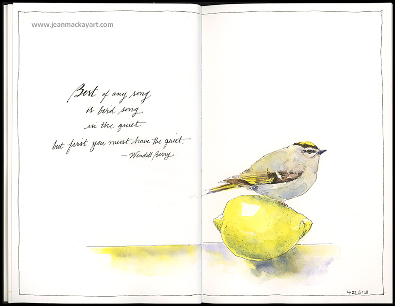
“Best of any song
is bird song
in the quiet
but first you must have the quiet.
— Wendell Berry
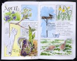
Seeking Spring
Is April the new March? Or am I too impatiently, too desperately, seeking spring? I go in search of greenery each week—into woods and wetlands, along meadow paths—and I can say with confidence, and disappointment, that my palette remains largely ochre and brown and overcast blue. Still, there are a few buds, and the Eastern phoebe wagging its tail in the still-bare maple, a hint of green under last year’s grass, and daylight past seven. Hold on and wait, they remind me, just around the corner is renewal.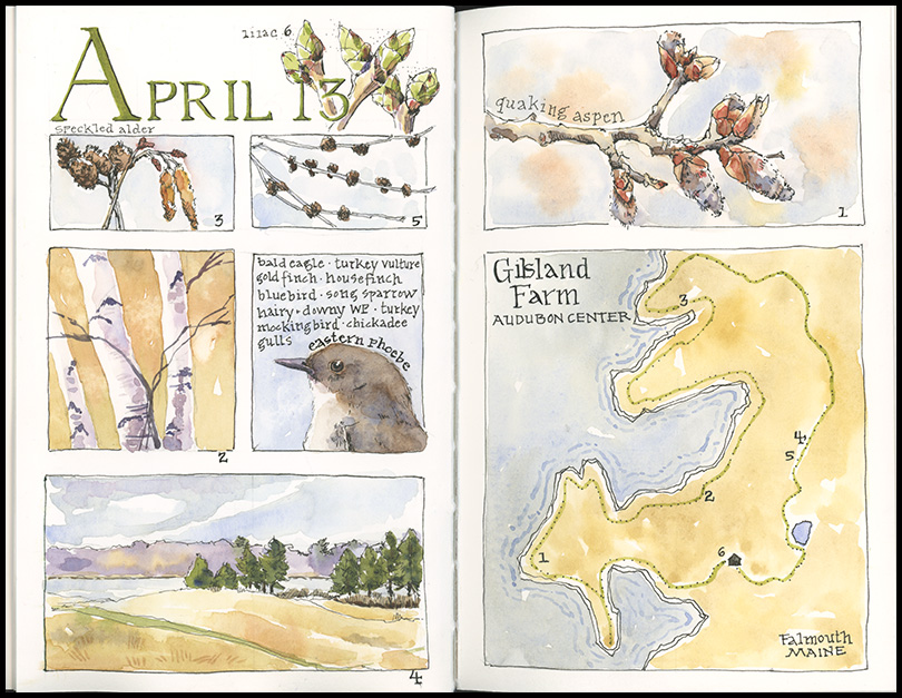
(click the image to view larger)
Tips and Techniques: I’ve done a few posts about using a grid and, here again, this format proved adaptable and well suited for a hike at the Gilsland Farm Audubon Center in Falmouth, Maine. In advance of the hike, I divided this 2-page spread into 12 equal squares, using light pencil outlines for each box. Once in the field, I combined boxes based on the subjects at hand. It was just warm enough to draw and paint in the field, and I added the lettering and outlined each box when back inside. I like the way these small vignettes add up to covey my overall experience, much more so than had I done a single sketch.
.
The Intersection of Art and Nature
I love finding myself at the intersection of art and nature. My passion for those two roads has led me to great places, wonderful people, and to beauty, insight, and mystery. Here, a simple fern in the Lyman Conservatory at Smith College has transported me half a world away to the rain forests of Malaysia. It has made me think about symbiotic relationships and to wish I had taken Latin. It has given me hours of artistic challenge and pleasure. And it has left me both grateful and eager for more.
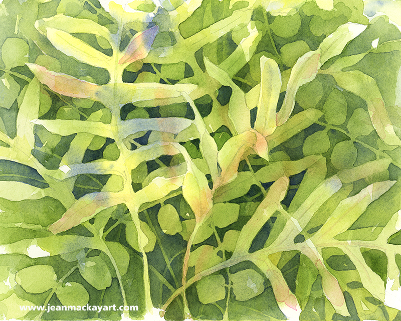
(click to view larger; top: watercolor and ink in Stillman & Birn “Beta” sketchbook 8.5×11″. Bottom: watercolor on 140lb Fabriano cold press paper 8×10″)
Tips and Techniques: I began these two paintings at the Conservatory, knowing it would be fascinating to take two very different approaches. While layers of paint dried on one, I rotated to the other. I had the major shapes established at closing time and finished both at home. What’s interesting to me is how each conveys such a different part of my experience in the greenhouse: one about being surrounded by layers of greenery, the other about a particularly intriguing fern. So, if there is a lesson here, it may be to consider what you most want to capture or convey when you begin drawing or painting. In essence, What draws you in? And what techniques are best suited to sharing that?
Green Fix
Where to begin? Presented with 3,000 plants in every shade of green and every texture and pattern of leaves, choosing a subject was no small task at the Lyman Conservatory at the Botanic Garden of Smith College in Northhampton, Mass. I spent the day there sketching and generally getting a much needed green fix after months of winter browns. Here’s the first of the pieces I did there, an exotic pitcher plant native to Borneo.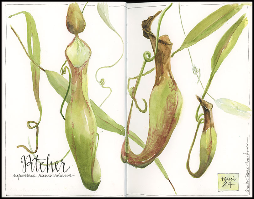
Tips and Techniques: What could be better for practicing how to mix greens? Use house plants or find a greenhouse near you and see how many shades of green you can mix. I used primarily sap green with raw umber and quin rose for the pitcher plants, but burnt sienna made its way into the tops of the pitchers and a lighter mix of sap green and cobalt blue helped the leaves and vines in the background recede. Take care when using reds with greens—mixing the two when wet will give you nice browns, but if you want to keep the red tones, wait until the green has dried and then add a layer of red on top.
Nest Trio
I get up early to make the 1.5 hour drive to the small town of Granville, New York, not far from Vermont’s Green Mountains. Arriving just before 10am gives me just enough time to buy a coffee before the doors open at one of my favorite places to sketch: the Pember Museum of Natural History. I make this pilgrimage once a year and I’ve already decided where I’ll spend the next four hours: hovering over the glass and cherry cases of Victorian-era bird nests and eggs. The selection is fantastic: eggs of every size and pattern, from tiny cream-colored hummingbird eggs to the huge streaked egg of the extinct great auk, and rows of woven nests decorated with leaves, lichen, and moss. I’ve drawn a good number of them over the years, so I choose ones I’ve passed over previously, put pen to paper, and begin. Hours later at closing time, it’s just me and the lone curator left in the museum and I’m satisfied…though I already look forward to my return next year.
I sketched this trio of nests in detail using a Micron pen on Fabriano hot press watercolor paper and painted them later at home. I did a fourth in my journal— the nest of the sedge wren, posted last week.
Tips and Techniques: When drawing a nest, spend a few minutes really looking at how it’s made before beginning. There are often interesting bits of materials that you’ll want to highlight. Usually the weave gets tighter in the inner cup, which may also be lined with downy material or feathers. Consider that the bird has already created the masterpiece. Your job is to translate it onto paper. Keep your lines very loose as you start, following the weave of twigs, grasses, or pine needles around the cup-like shape. Once the basic structure and strands of material are roughed in, I typically use negative painting (or drawing) techniques to weave darker shapes and strands underneath lighter ones to develop the complex weave. Pay attention to values! Getting darks and shadows in place will really make your nest take shape.
I will be ordering prints of this painting for sale for $30 (includes mailing). If you would like to order a copy, please e-mail me at jeanmackay.art@gmail.com. Prints are made on archival quality Hahnemuhle Museum Etching paper, 8”x10” and suitable for easy matting and framing.


